
Client: Cresco Labs, Reserve
Location: Chicago
Industry: Cannabis
Website: www.crescolabs.com
Our Role:
+ Creative Direction
+ Visual Identity
+ Packaging
+ Brand Strategy
+ Brand Messaging
+ Naming
+ Campaigns
Industrial Design:
MNML Design Studio
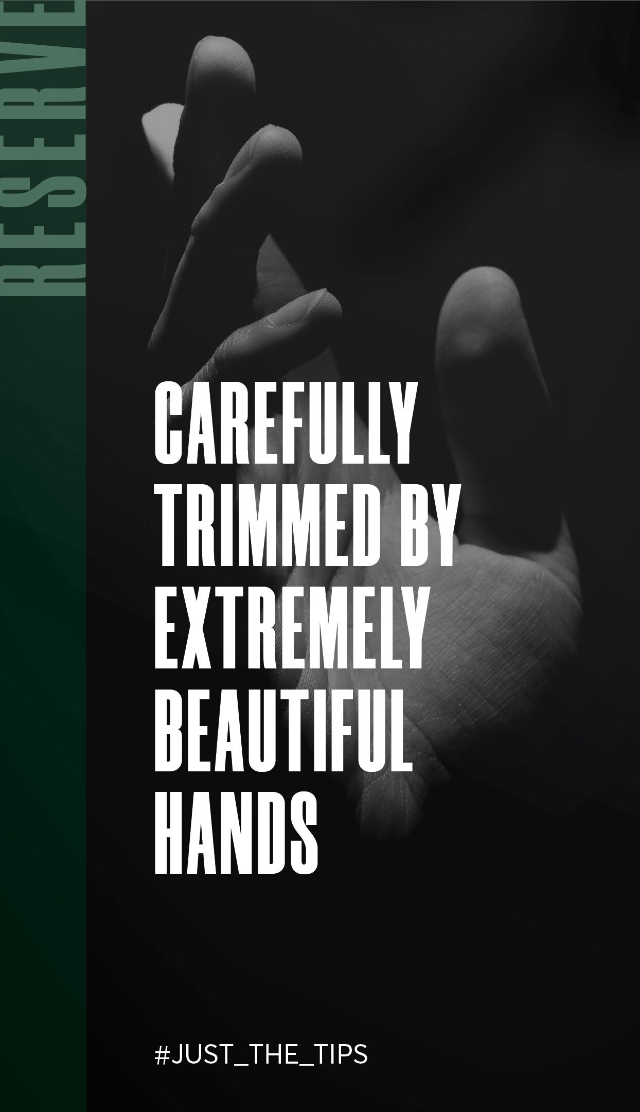
Carefully trimmed by extremely beautiful hands.
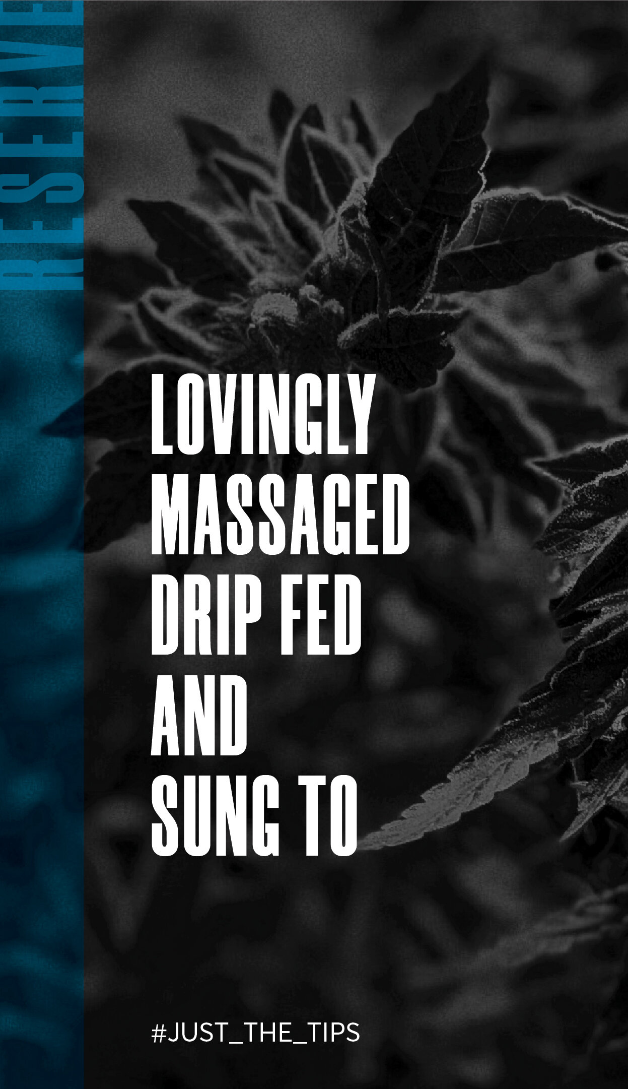
Whereas Cresco’s flagship brand is about ubiquity, Reserve is about class – this is the top 10% of their growth, and is meant for users who truly care about getting the highest quality product. Just like the Reserve product is only the top 10%, the Reserve brand quite literally trims the top 10% off its wordmark.
The juxtaposition of matte and shine create a luxurious and tactile feeling, with a gorgeous, cool color palette to stand out on the shelf. While the packaging, at first glance, is elegant and, dare we say, sexy, we also needed to highlight the quality of the product inside…so why not add a little surprise, by making the bottom of the package completely transparent.


Kind words
“Years ago I worked for a founder who said, “I only want to work with smart, driven and nice people” and that has stuck with me throughout my career. I believe I have found that with this team. I am very pleased with the foundation we are building and excited about where we are going. ”