
Client: Ahya
Location: Austin
Industry: Health & Wellness
Website: www.ahya.co
Our Role:
+ Naming
+ Visual Identity
+ Brand Strategy
+ Messaging
+ Packaging Design
+ Web Design
+ Creative Direction
A Beautiful Balanced Life.
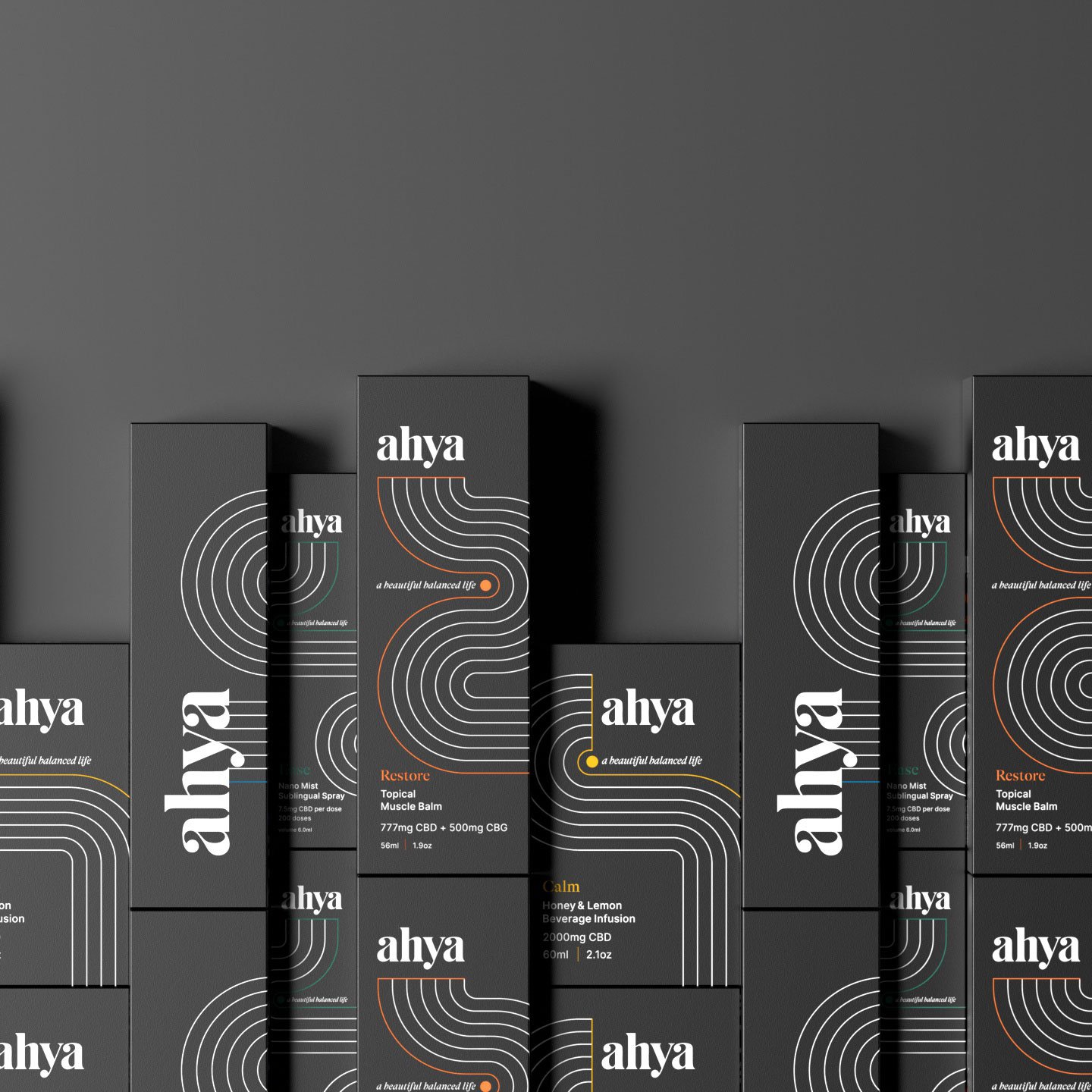
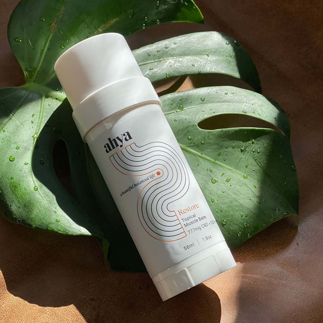
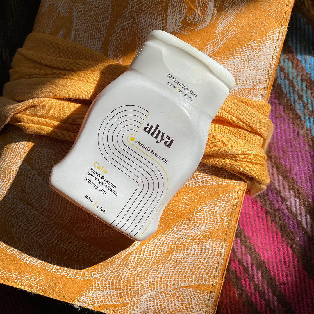
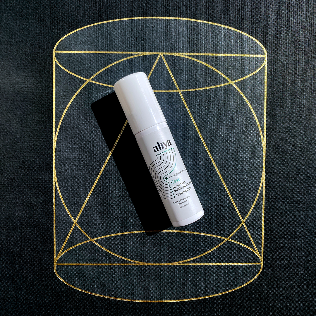
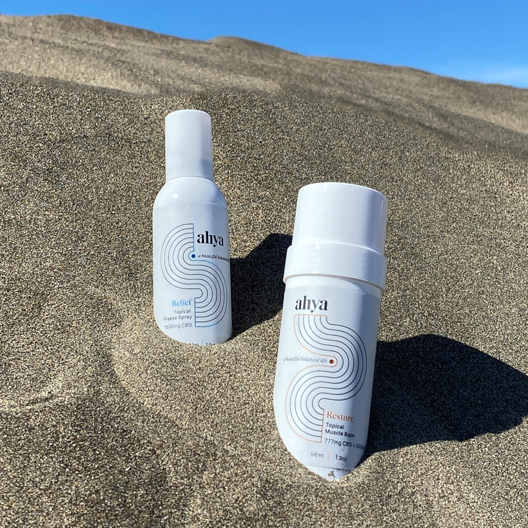
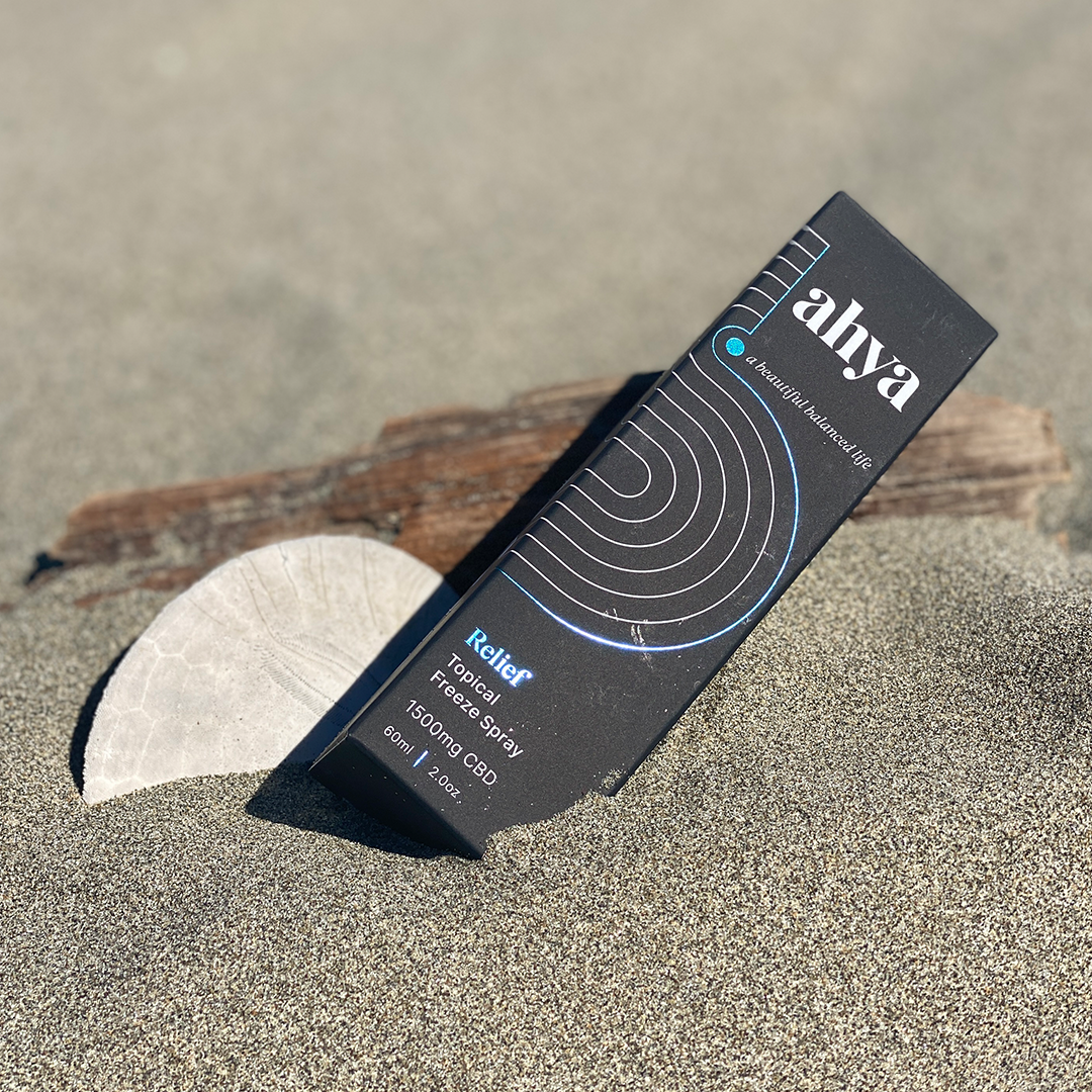
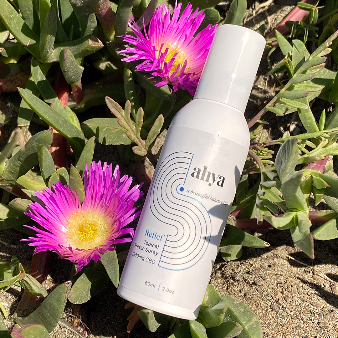
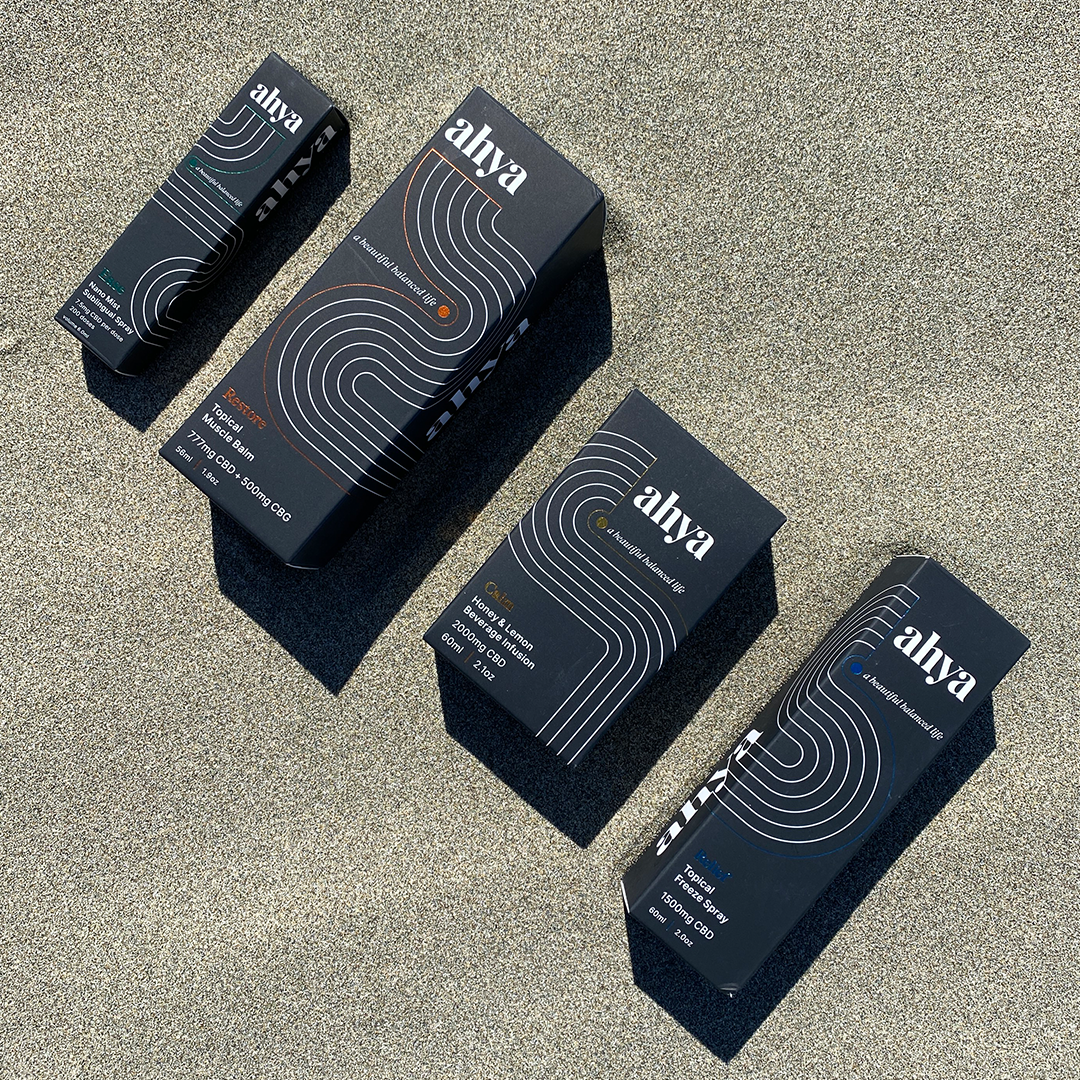
In a sea of sameness, selection overdose, and ineffective formulas that leave us searching for more, leading to wasted time, effort, and money - Ahya makes plant-based, organic, and ethically sourced CBD products that are good for your body. We partnered with co-founders Ashley & Greg to create a name, brand, and strategy as beautiful as their perfectly balanced products. The name Ahya was derived from the expression you make when things just feel right…ahh yeah. Our graphic rake line treatment is used to bring a sense of calm and animated dynamically to reveal our brand promise, product, or wordmark. Each product package has a distinct color and rake pattern printed with hot foil and white ink on matte black card-stock that elegantly stands out on shelf.


Kind words
“You created something from nothing, and in the temporal world we live in, maybe something meaningful, maybe something that can last. My heart is full. We will be good stewards of this brand. Thank you.”