
Client: Cresco Labs, High Supply
Location: Chicago
Industry: Cannabis
Website: www.highsupplyofficial.com
Our Role:
+ Creative Direction
+ Visual Identity
+ Packaging
+ Creative Strategy
+ Brand Strategy
+ Brand Messaging
+ Naming
+ Campaigns
Partners:
Industrial Design: MNML Design Studio
Photography: Rain Studio
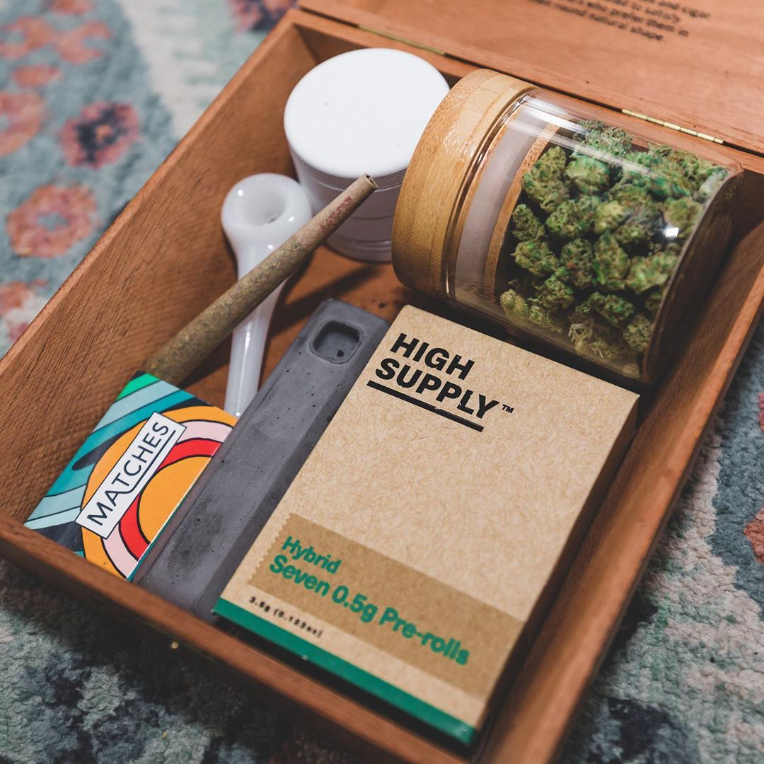
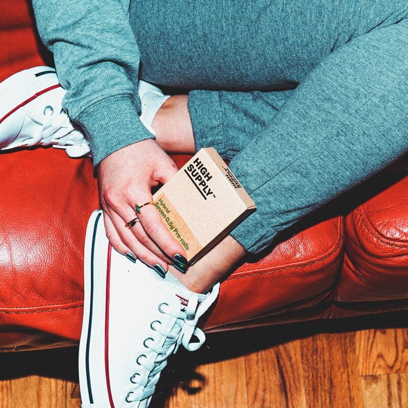
Consistently good cannabis.
Sometimes we just need some good, affordable weed. But often, the most accessible cannabis is low quality – it’s hard to know what you’re going to get. With High Supply, Cresco Labs offers its most consistent and accessible brand. A surplus of premium, local flower means high quality cannabis at its most affordable price. To help build an identity that reflects this freshness and consistency, we looked to the timeless neo-grotesque sans-serif type Neue Haas Unica Pro. Utilizing a simple typeface as the logo allows the product to speak for itself, and gives flexibility to stamp the brand onto a variety of media. Playing off the classic ‘Thank You’ type on takeaway plastic bags, High Supply can be locked in black or white and repeated over the packaging, on candid lifestyle photography for campaigns, and on fashion. A simple flash of primary color is applied with the cannabis varietal stamp (indica, sativa, hybrid), complementing the playful, handmade quality of the brand. Sometimes a brand is less about frills and more about a statement. High Supply is consistently good cannabis. That’s it.


Kind words
“Years ago I worked for a founder who said, “I only want to work with smart, driven and nice people” and that has stuck with me throughout my career. I believe I have found that with this team. I am very pleased with the foundation we are building and excited about where we are going. ”