Client: Cresco Labs
Location: Chicago
Industry: Cannabis
Website: www.crescocannabis.com
Our Role:
+ Creative Direction
+ Visual Identity
+ Packaging
+ Creative Strategy
+ Brand Strategy
+ Brand Messaging
+ Naming
+ Campaigns
Partners:
Industrial Design: MNML Design Studio
Photography: Rain Studio
Excellent everyday everyday everyday cannabis.
Until now, cannabis companies have been focused on either education/de-stigmatization, or playing into existing cannabis culture and motifs. But for a brand to become a mainstream, globally recognized leader, it is critical to have a design language that is simple, clear, and iconic.
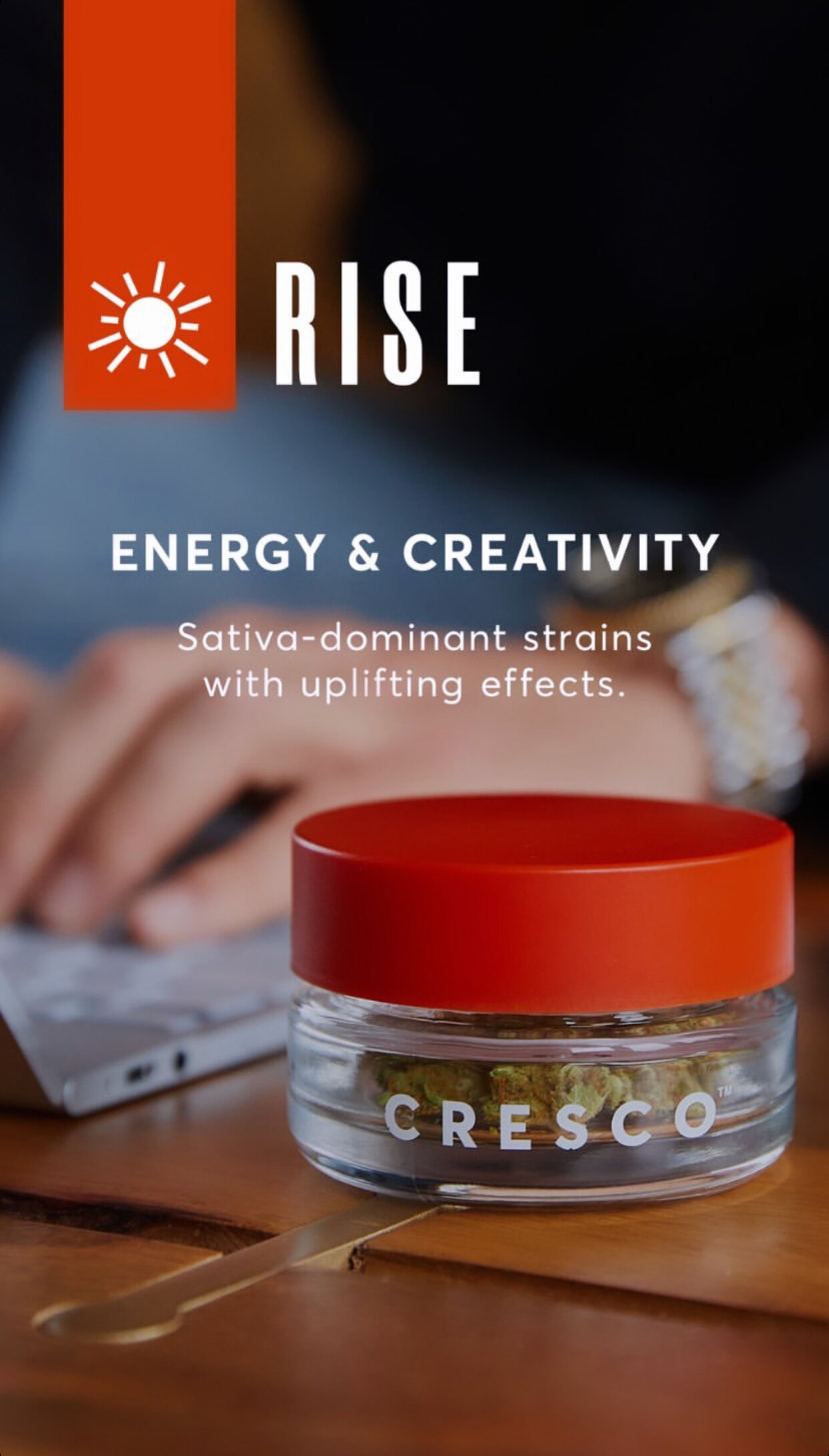
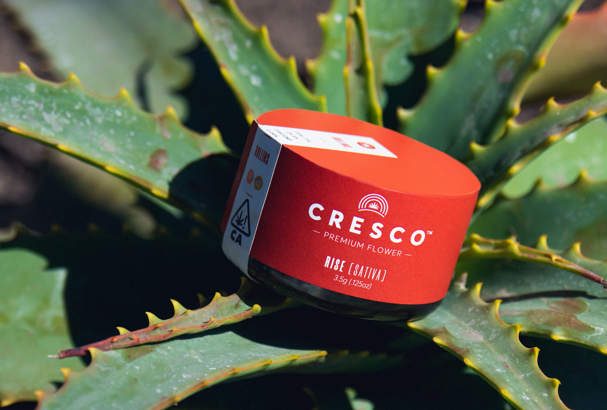
The word Cresco is Latin for ‘to grow,’ and the entire brand reflects this theme. For the Cresco flagship brand, the logo plays on the 7-pointed star of the cannabis leaf, but makes it its own in an abstract form that also parallels the sun on the horizon. Many cannabis brands don’t grow their own product, so Cresco’s brand has to highlight the holistic nature of the business and the quality of their work. The three rings of the sun represents the 30 days for which the cannabis is dry-aged. The logo feels pure, and when placed on clear packaging, the transparency allows for customers to see the quality of the product for themselves. Custom iconography educates users about the terpenes in the product – a full language for customers to clearly understand what is in their product and how it will make them feel. This iconography is repeated across brand channels to help create cohesion under the Cresco umbrella.
Kind words
“Years ago I worked for a founder who said, “I only want to work with smart, driven and nice people” and that has stuck with me throughout my career. I believe I have found that with this team. I am very pleased with the foundation we are building and excited about where we are going. ”


