Igniting [possibility}
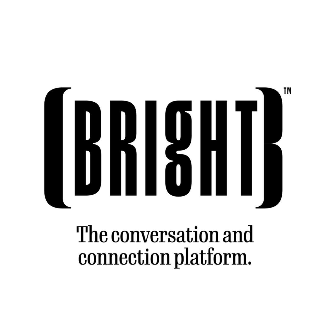
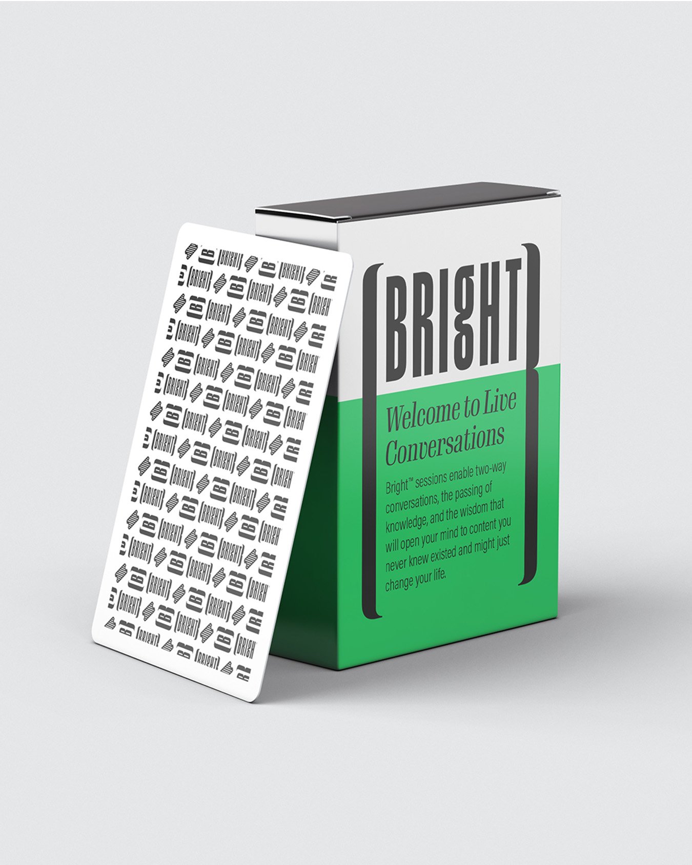
Bright is the conversation and connection platform built for the stuff that hits you after the lecture, not during it. The moment that lands and changes your angle. Bright turns that “wait, what?” into a live experience you can join, feel, and carry with you.
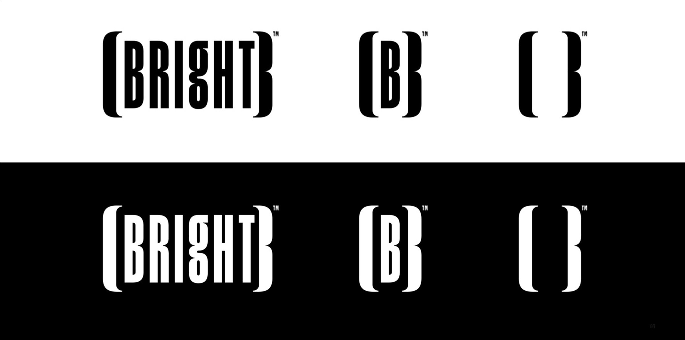
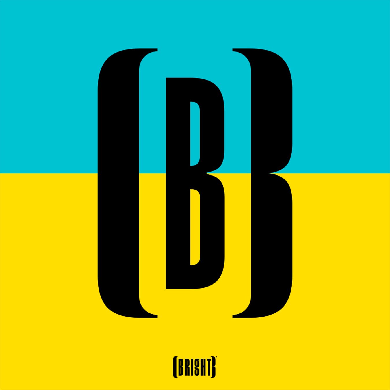
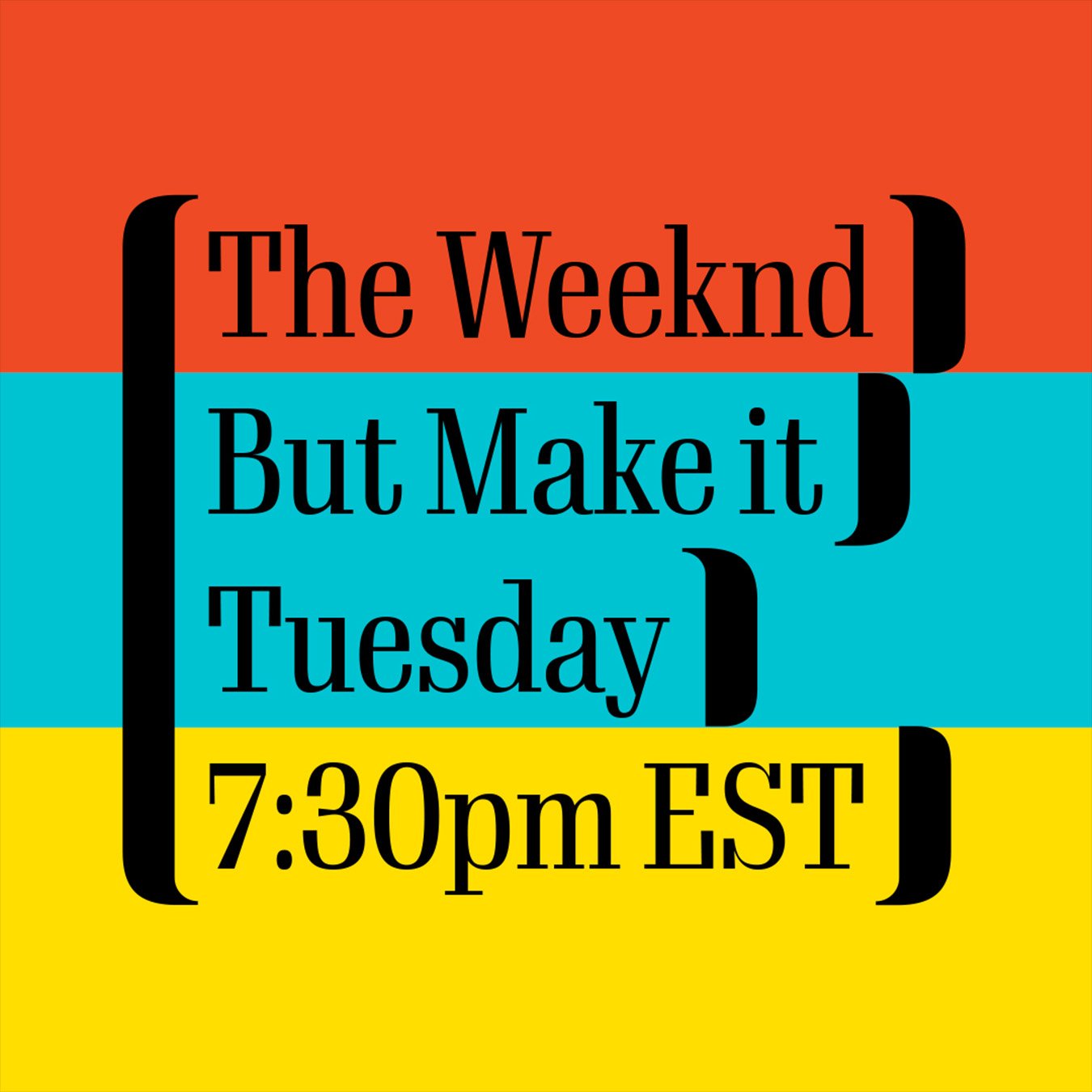
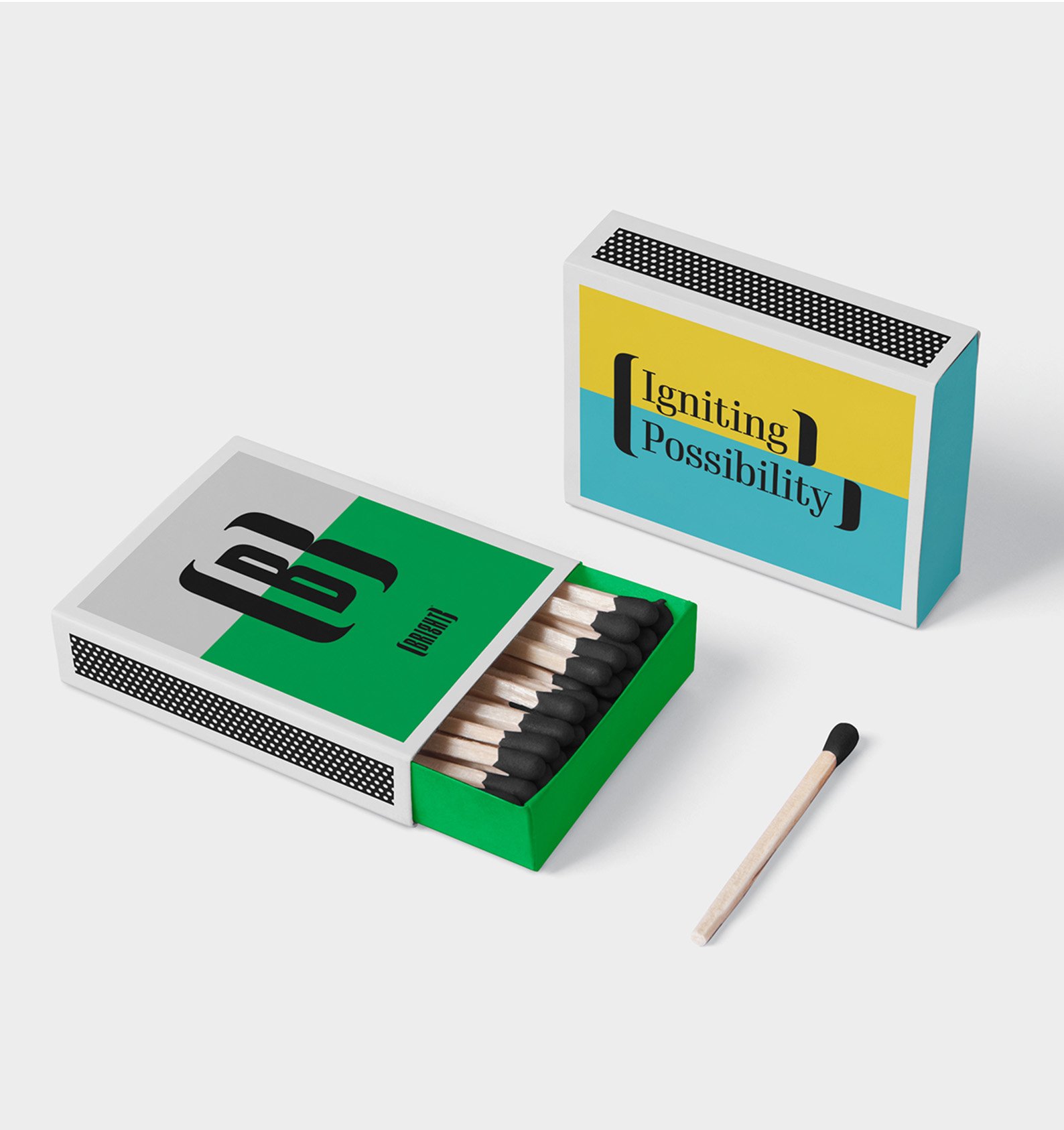
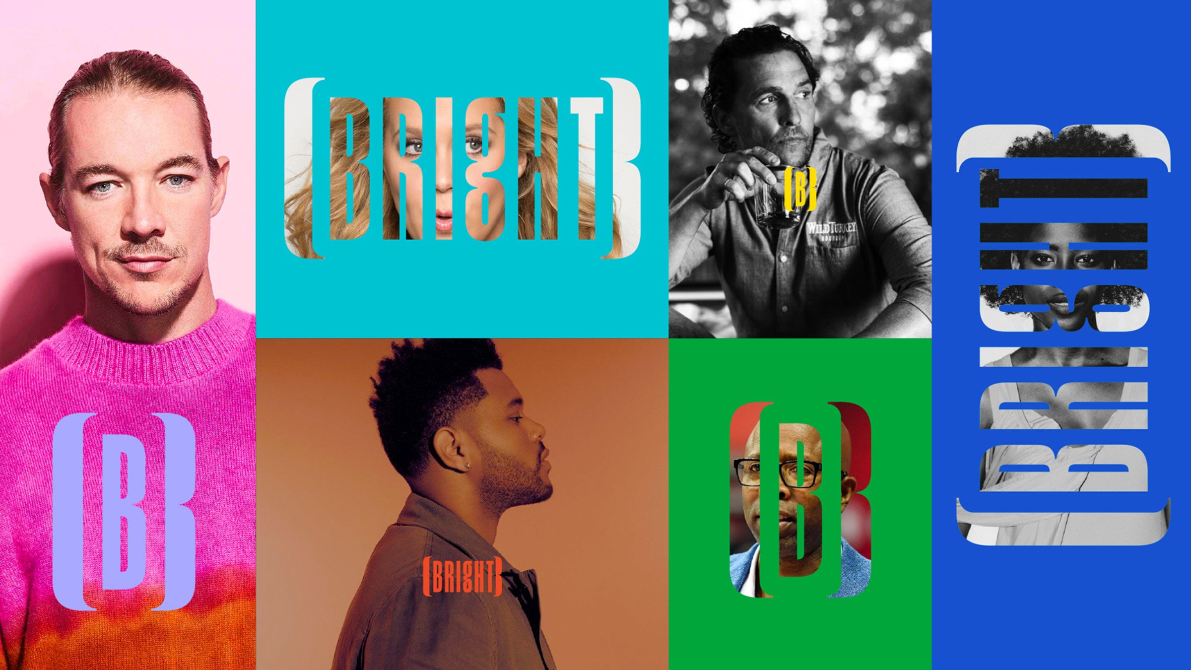
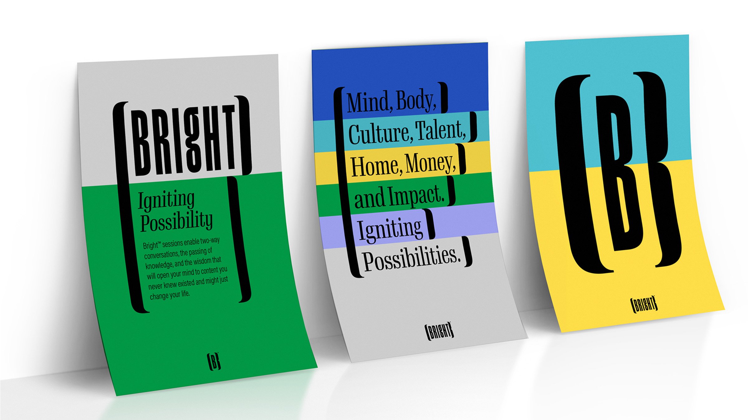
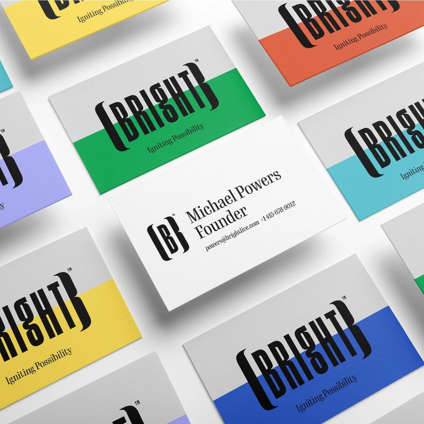
The identity uses custom, condensed letterforms that feel iconic and modern, anchored by the bracketed “B” that becomes the system’s shorthand everywhere. Then we pushed it into a full world: a bold color spectrum, a custom symbol font, icons for every role and action, and templated layouts that scale from app to posters to social without losing the plot.
Underneath the visuals is a clear point of view: leave an impression, stay vital, embrace imperfection, reach for extraordinary. Bright is designed to spark an upward spiral through people, design, and civility, so every session feels open, human, and worth showing up for.
Client:
Bright
California
Our Role:
Brand Strategy
Logo & Identity
Iconography
Collateral Applications
Digital Assets
Brand Messaging
“A virtual startup environment is a curious place to bring brand virtue to life, theater takes a backseat to deliverables, the rigidity of product supplants the stretch of the intangibles, and it’s all sold in a frame of Zoom. LP provided a great service to us, took us through a desert and we see the sea now. Thank you for the work and the experience throughout.”