Client: Cresco Labs, Remedi
Location: Chicago
Industry: Cannabis
Website: www.chooseremedi.com
Our Role:
+ Art Direction
+ Creative Direction
+ Visual Identity
+ Packaging
+ Brand Strategy
+ Brand Messaging
+ Naming
+ Campaigns
Partners:
Industrial Design: MNML Design Studio
Photography: Rain Studio
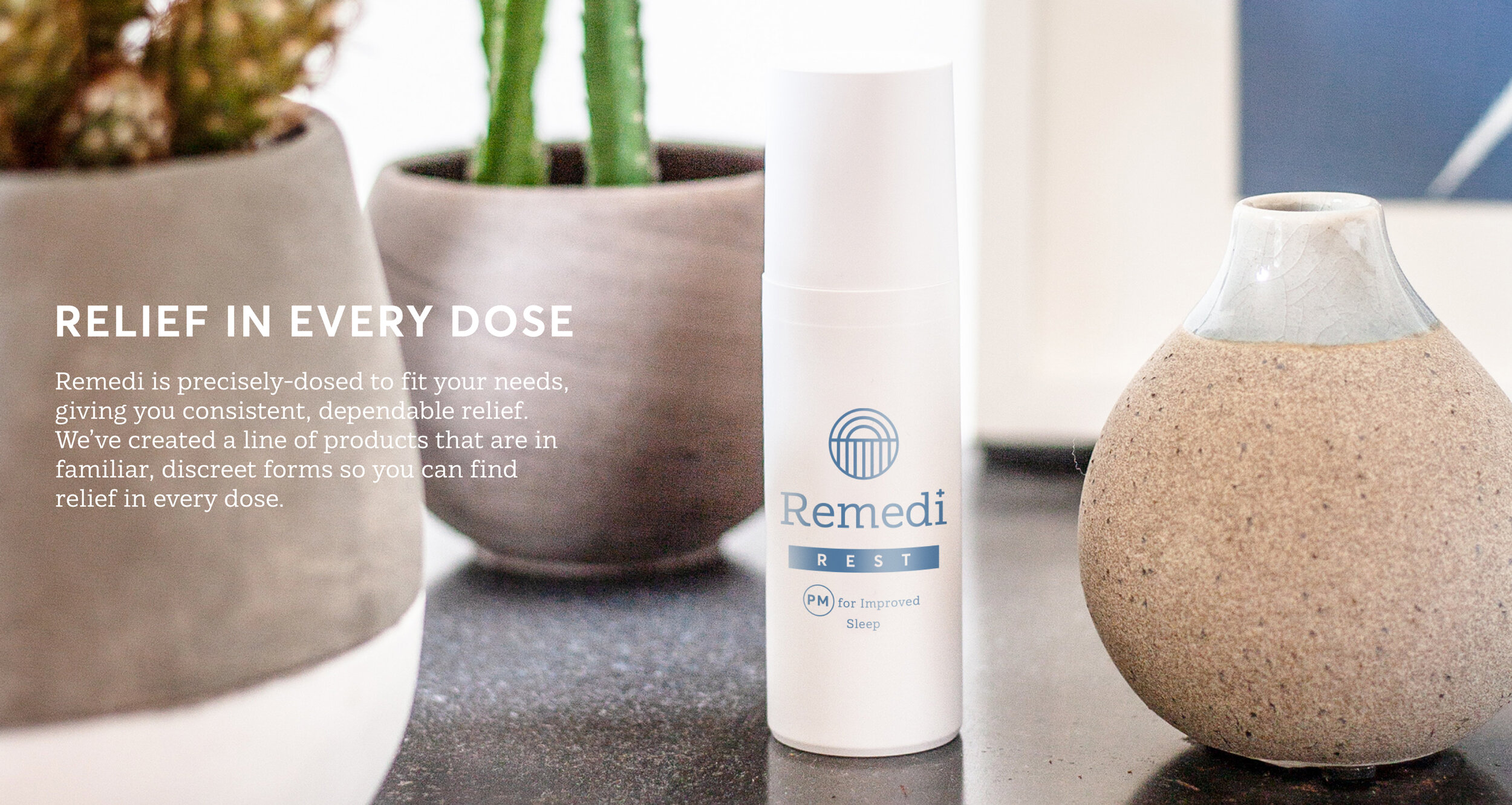
Relief in every dose.
While some people use cannabis for fun, many others use it to address serious health issues and chronic pain. Remedi provides precisely dosed products to provide relief with no ambiguity.
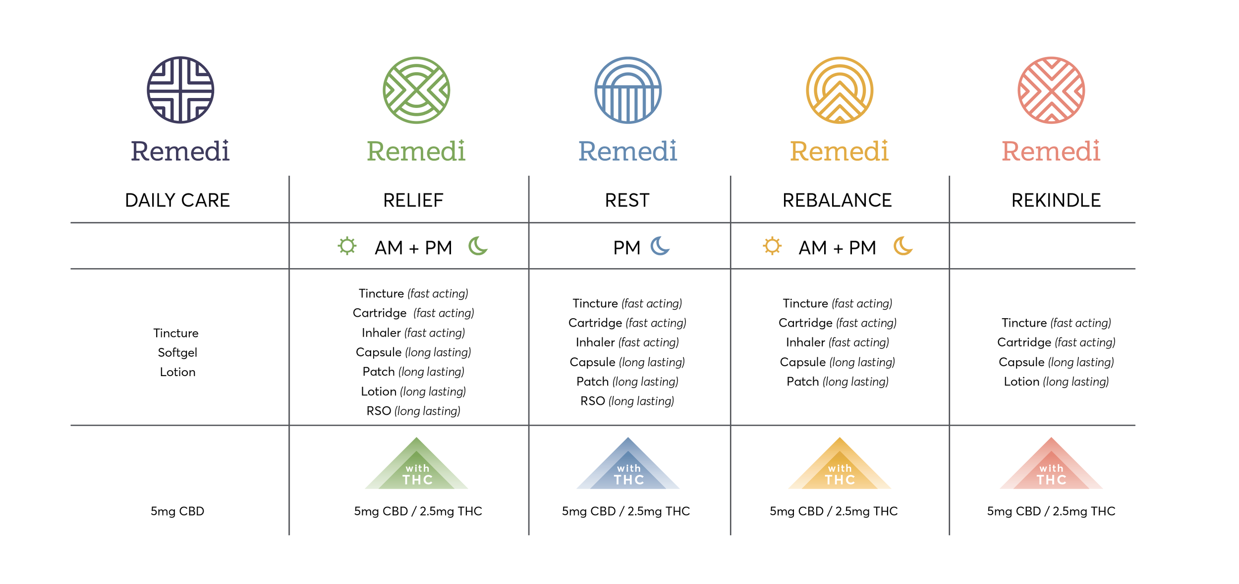
As this is a brand that’s more likely to live in your medicine cabinet than anywhere, we wanted to remove any possible stigma by providing a clean, medical aesthetic that would match the other products on your shelf. However, simplicity does not mean boring. The radiating cross clearly communicates its medicinal value, with a custom iconography that flexibly translates into a variety of uses. The lines form an X for Rekindle (intimacy); a calming sunset for Rest (sleep); Rebalance shows a mountain top (balancing your system); and two pinpointed areas reflect Relief (pain). Simple mono-lines using circles and squares form the basis of the design system – an elegant solution that allows the brand to scale and change as needed. With patches, capsules, and droppers, Remedi provides discreet and clear support.


