Best of Behance: Bright Branding
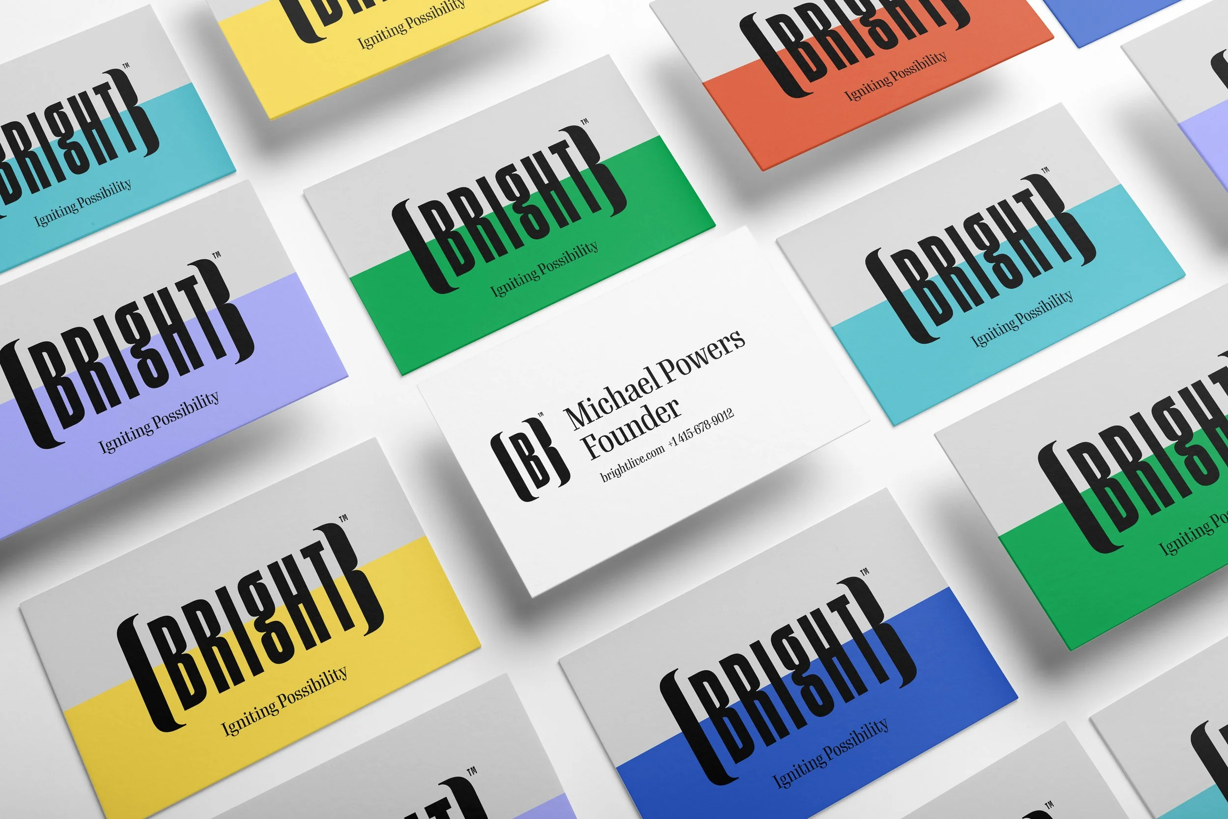
We brought meaning to Bright by creating a unique [B} icon. Brackets are naturally used to enclose words intended to clarify meaning, provide a brief explanation, or to help integrate a quote into the writer's sentence. Our [B} icon mimics the custom bracket surrounding Bright. We use this bracket to enhance our headlines and create brand equity beyond our icon. The words mark is a custom drawn condensed sans serif with modern grotesque construction. The tall set lowercase ‘g’ evokes a friendly approachable feel bringing a lightness to the strong characters on both sides.

