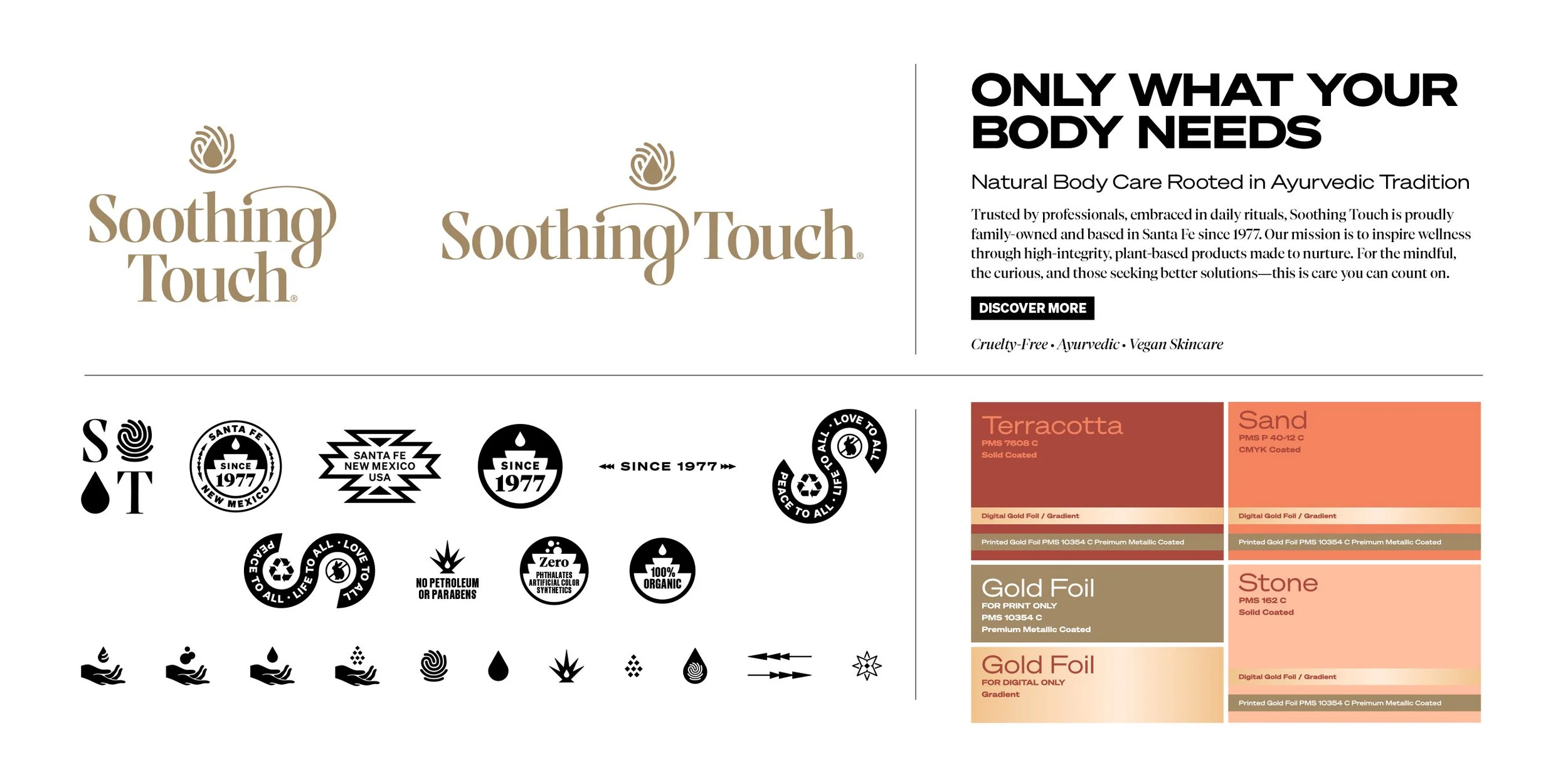
Only what your body needs.
Rooted in Ayurvedic tradition and based in Santa Fe since 1977, Soothing Touch creates trusted body care products embraced by professionals and daily rituals alike. Lobster Phone led a full rebrand to reconnect the visual identity to the brand’s heritage, values, and purpose; modernizing without losing its soul.
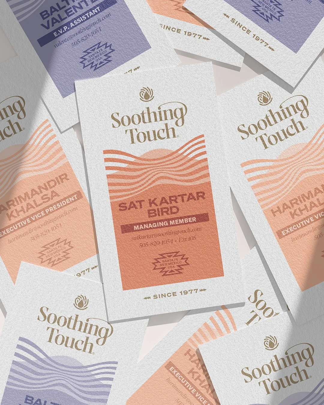
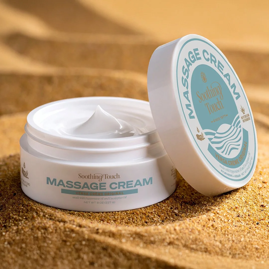
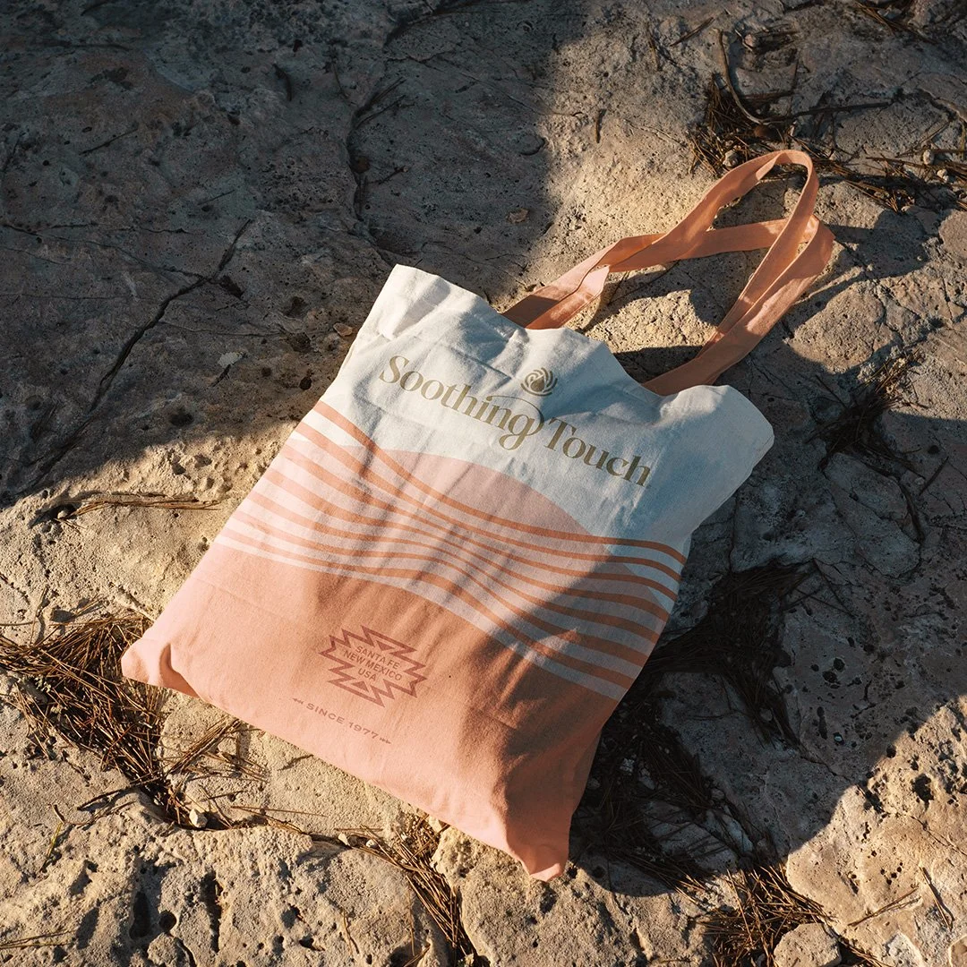
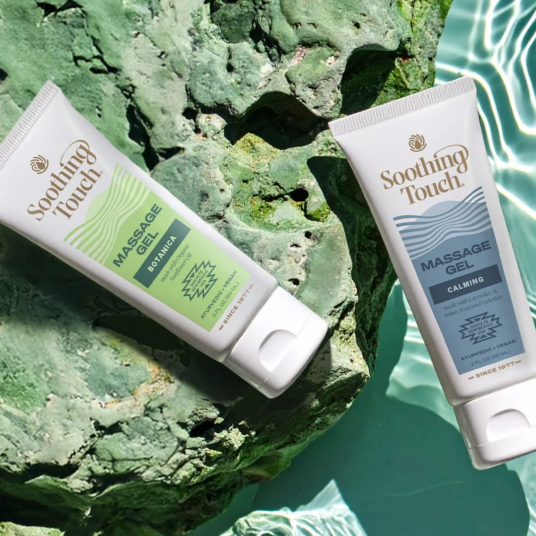
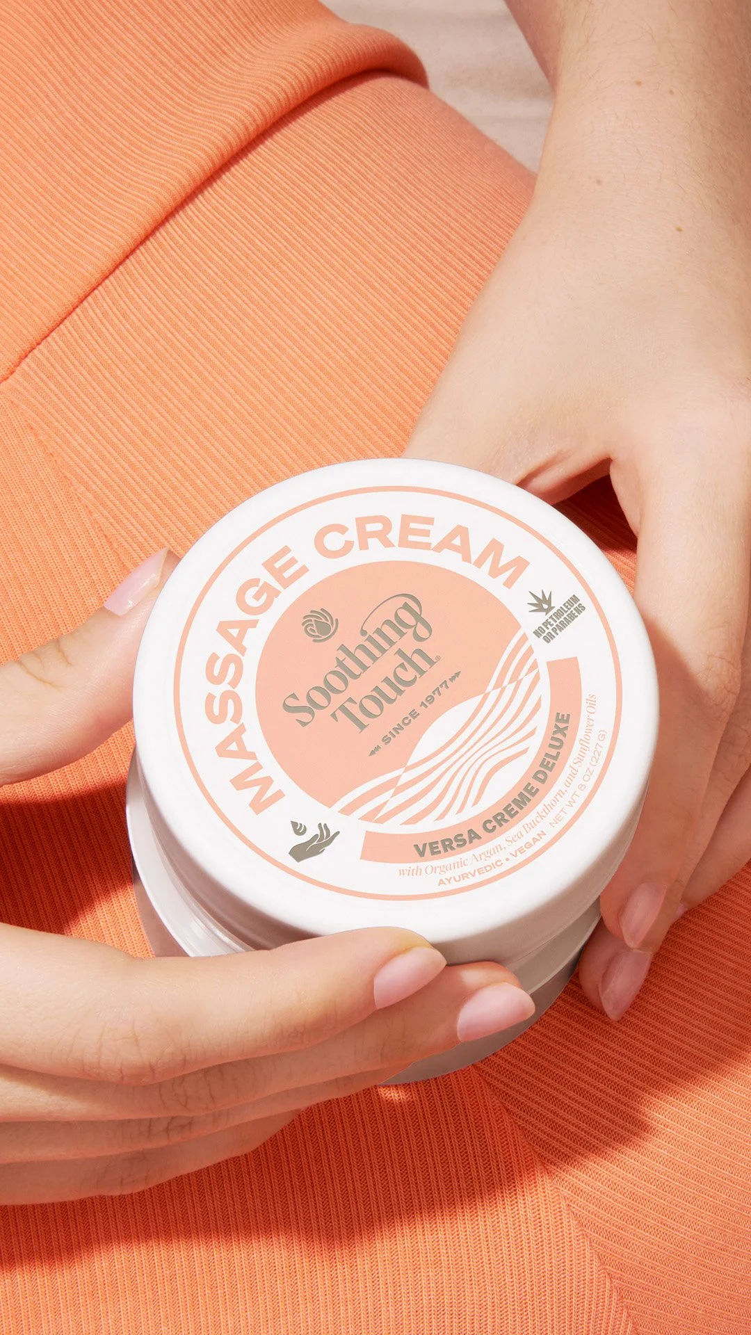
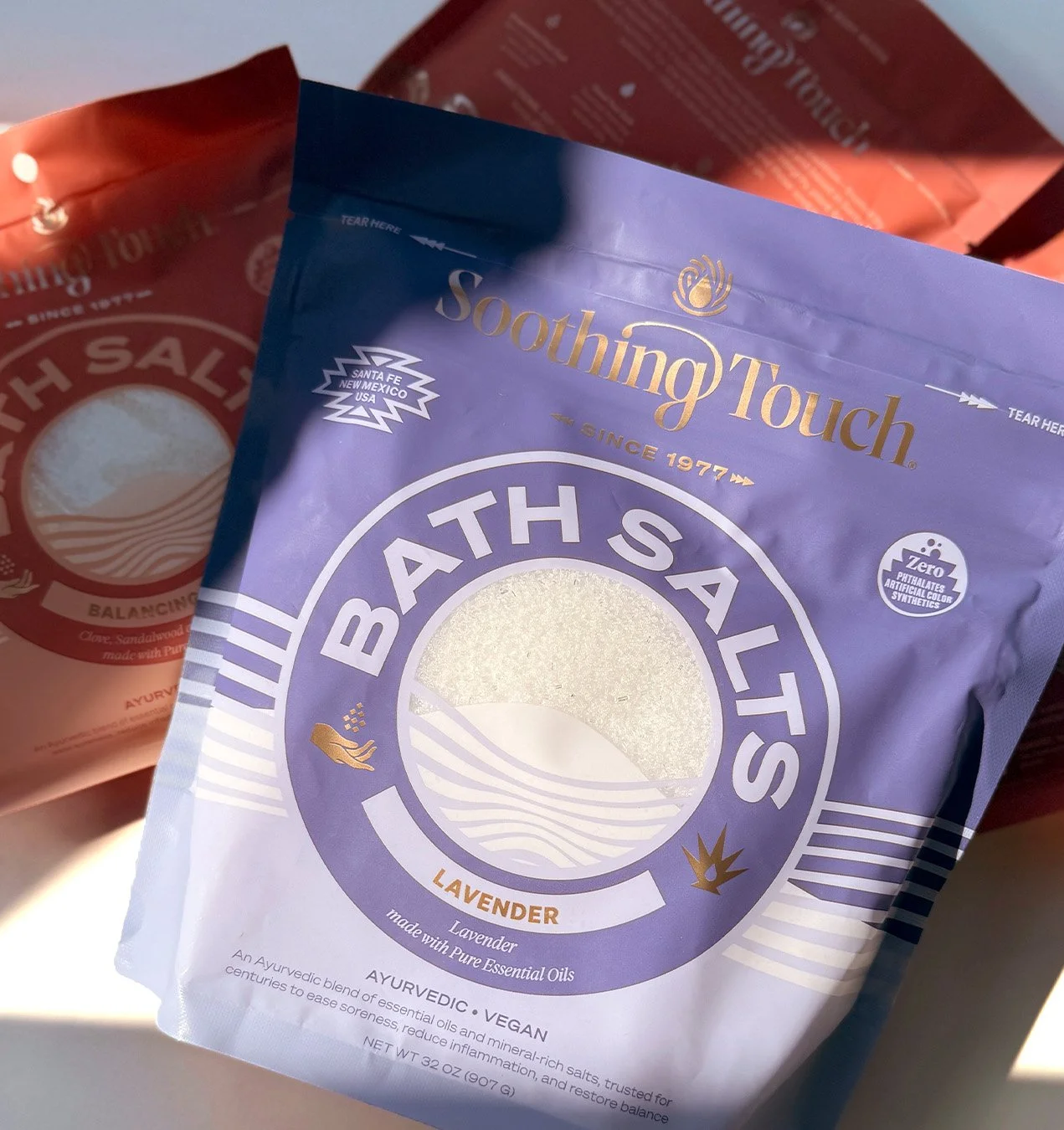
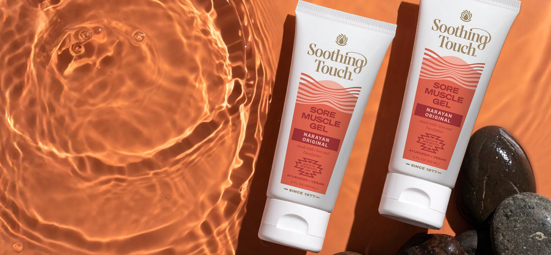
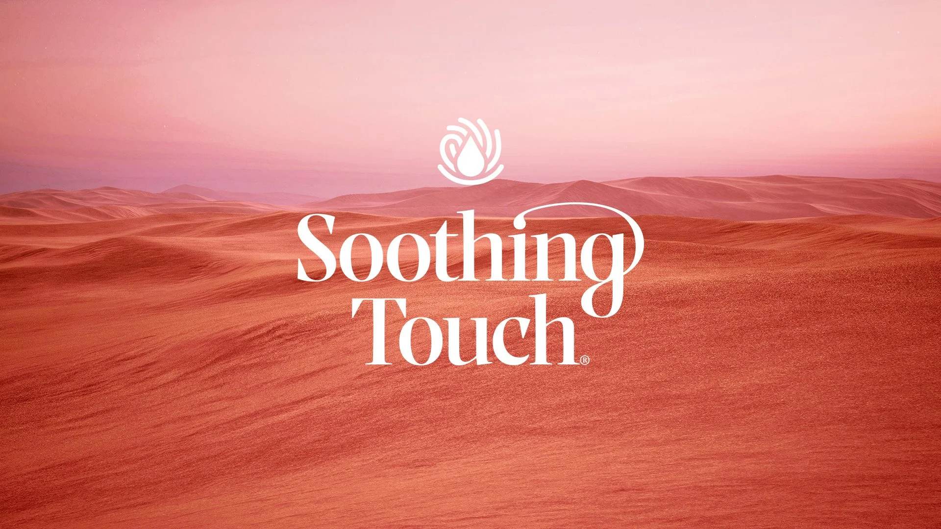
We crafted a strategy and identity system that balances ritual and clarity. The fingerprint and droplet mark symbolize both care and connection, while the wave graphic evokes the layered landscapes of Santa Fe and the calming rhythm of application. A refined logo suite, custom iconography, structured type system, and systematic color palettes help organize nearly 100 SKUs across a broad product line.
The result is a brand that feels grounded, expressive, and ready to grow. Built to show up beautifully across packaging, digital, and in the hands of those who use it daily.
Client:
Soothing Touch
Santa Fe, New Mexico
Our Role:
Brand Strategy
Logo & Visual Identity
Labels & Packaging
Digital Assets
Creative Direction
Brand Messaging
Campaigns
“Kristine maintains a structured and professional process, and offers an infectious enthusiasm for what she does. When faced with challenges, she meets them head-on with excitement, viewing them as opportunities to refine her process and deliver even better results for her clients.”