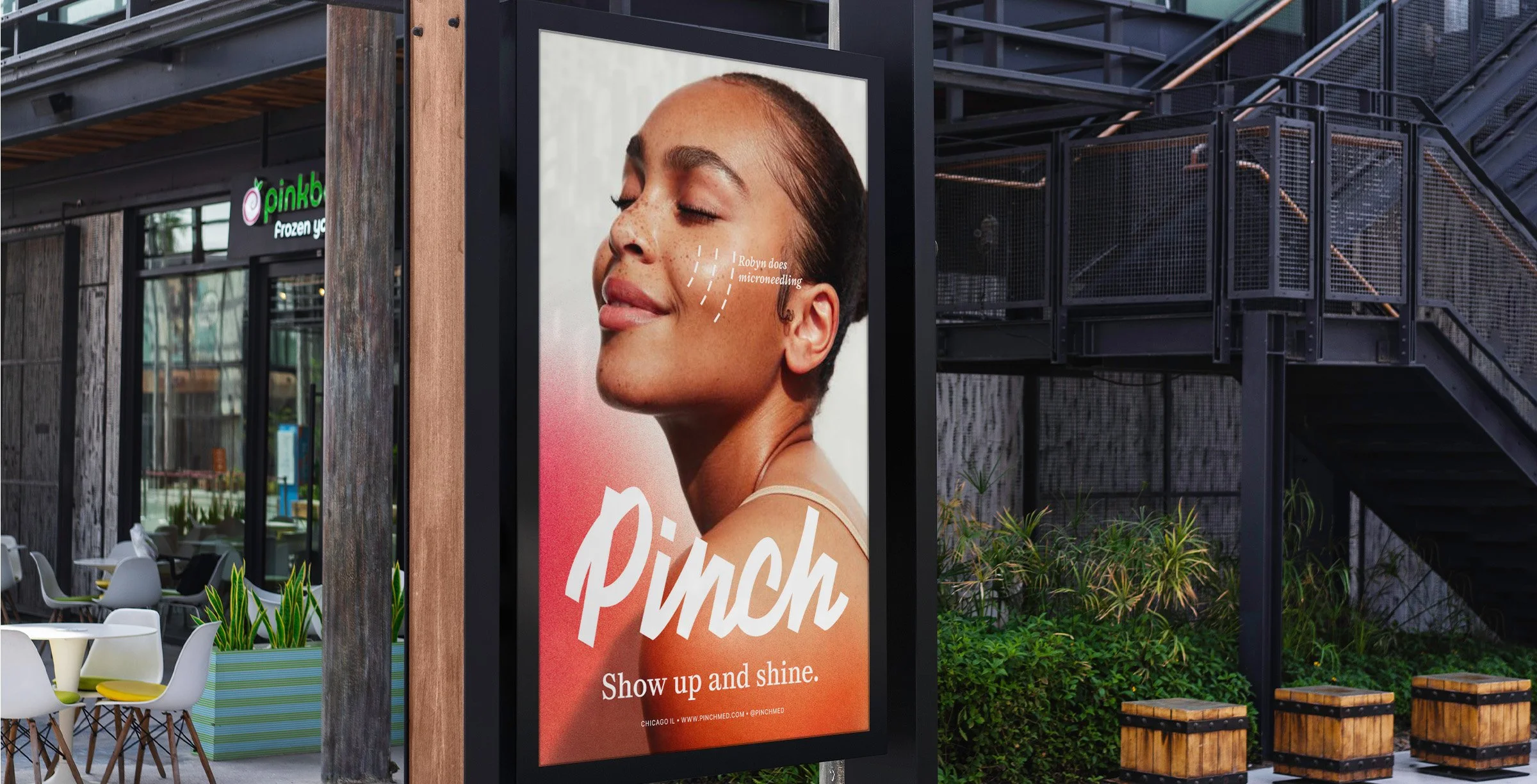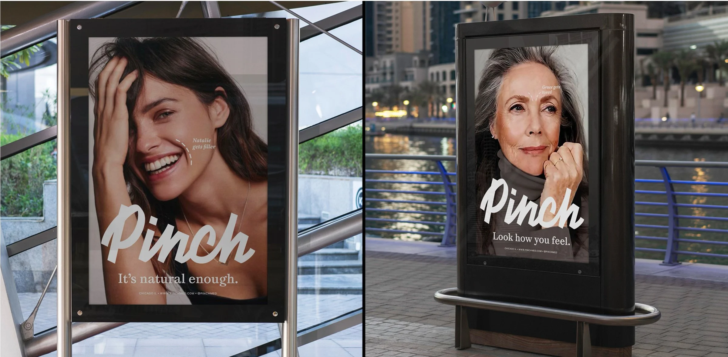
Less friction, more confidence
Pinch connects people with nurse providers for cosmetic injectables and treatments, delivered at home or at the office. It is medical aesthetics made easy. Less friction, more confidence.
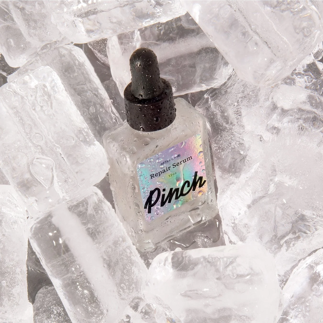
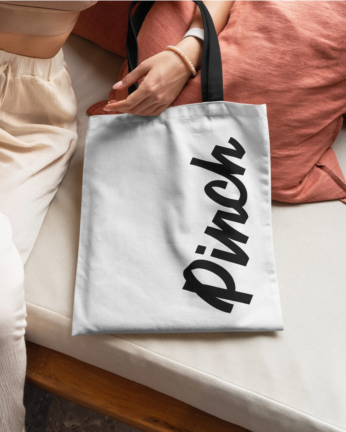
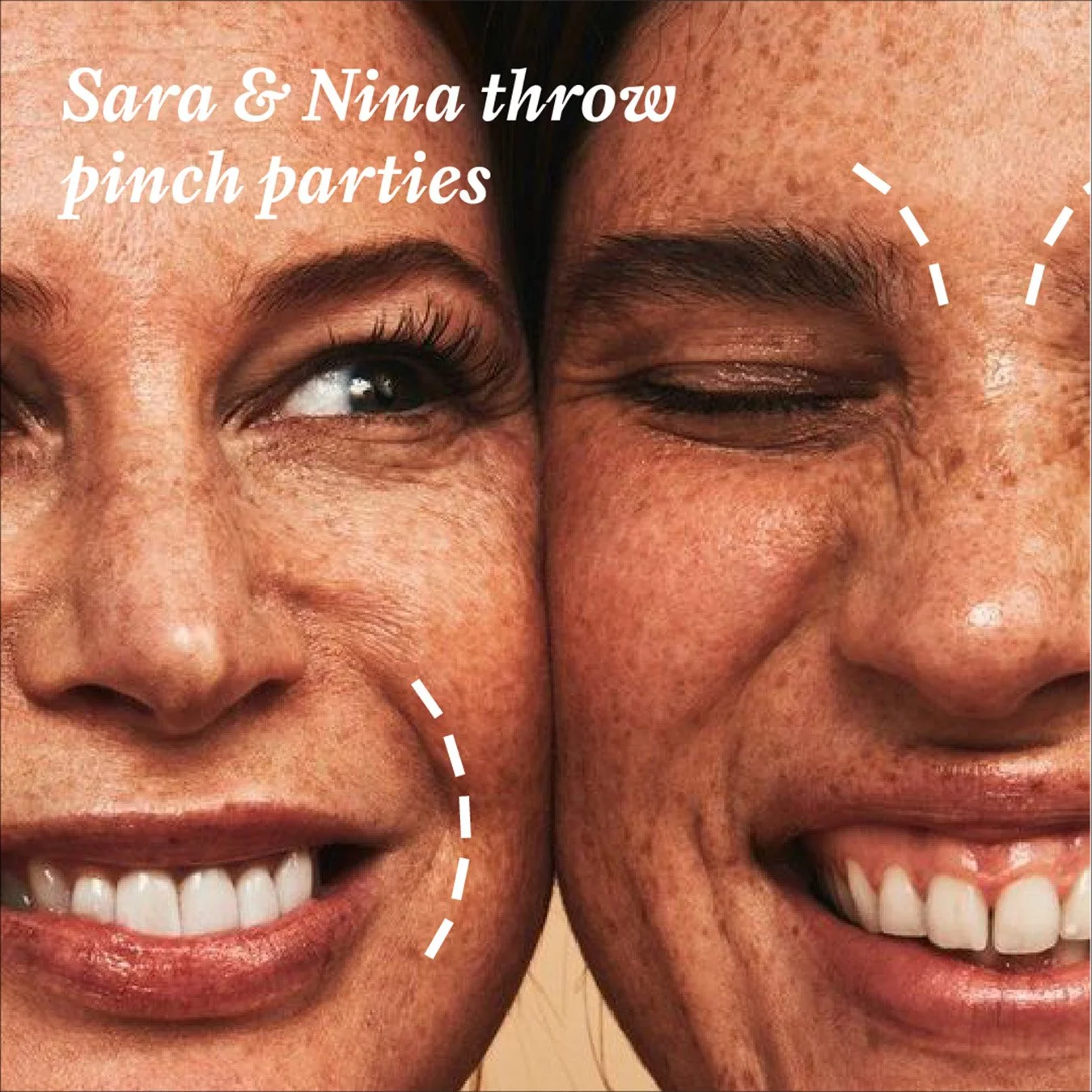
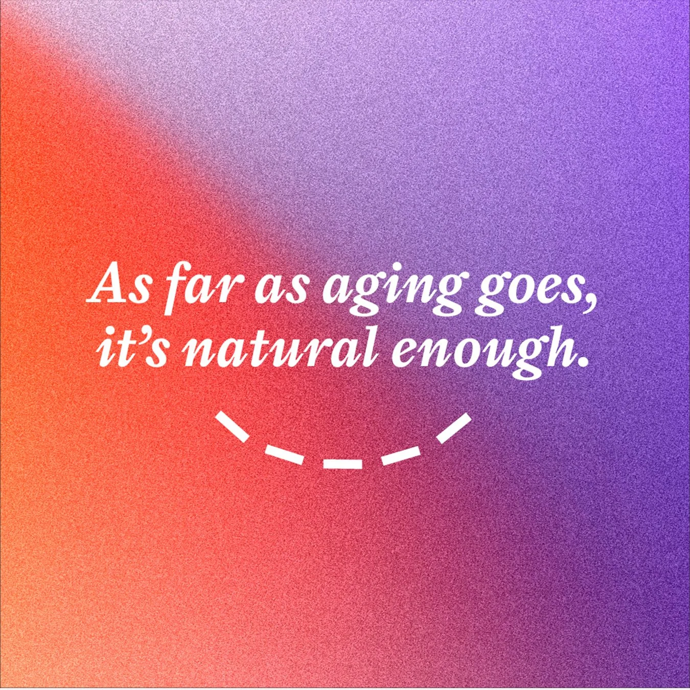
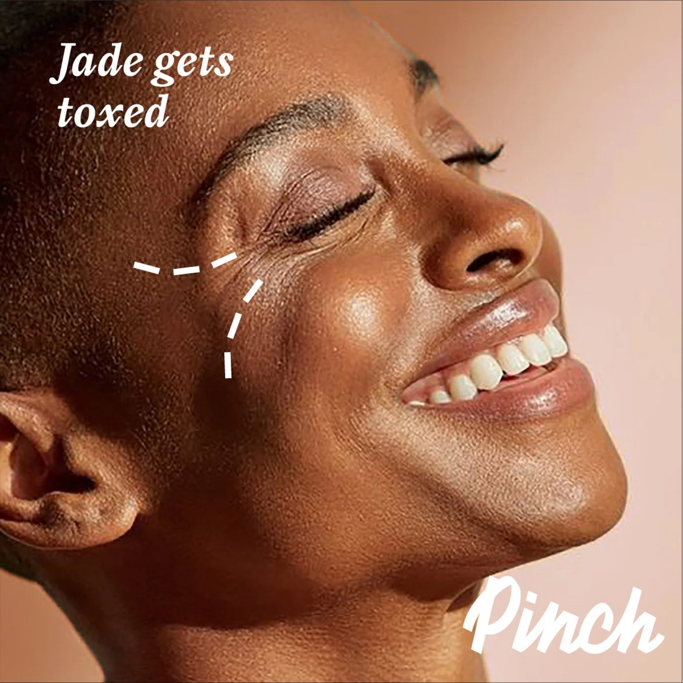
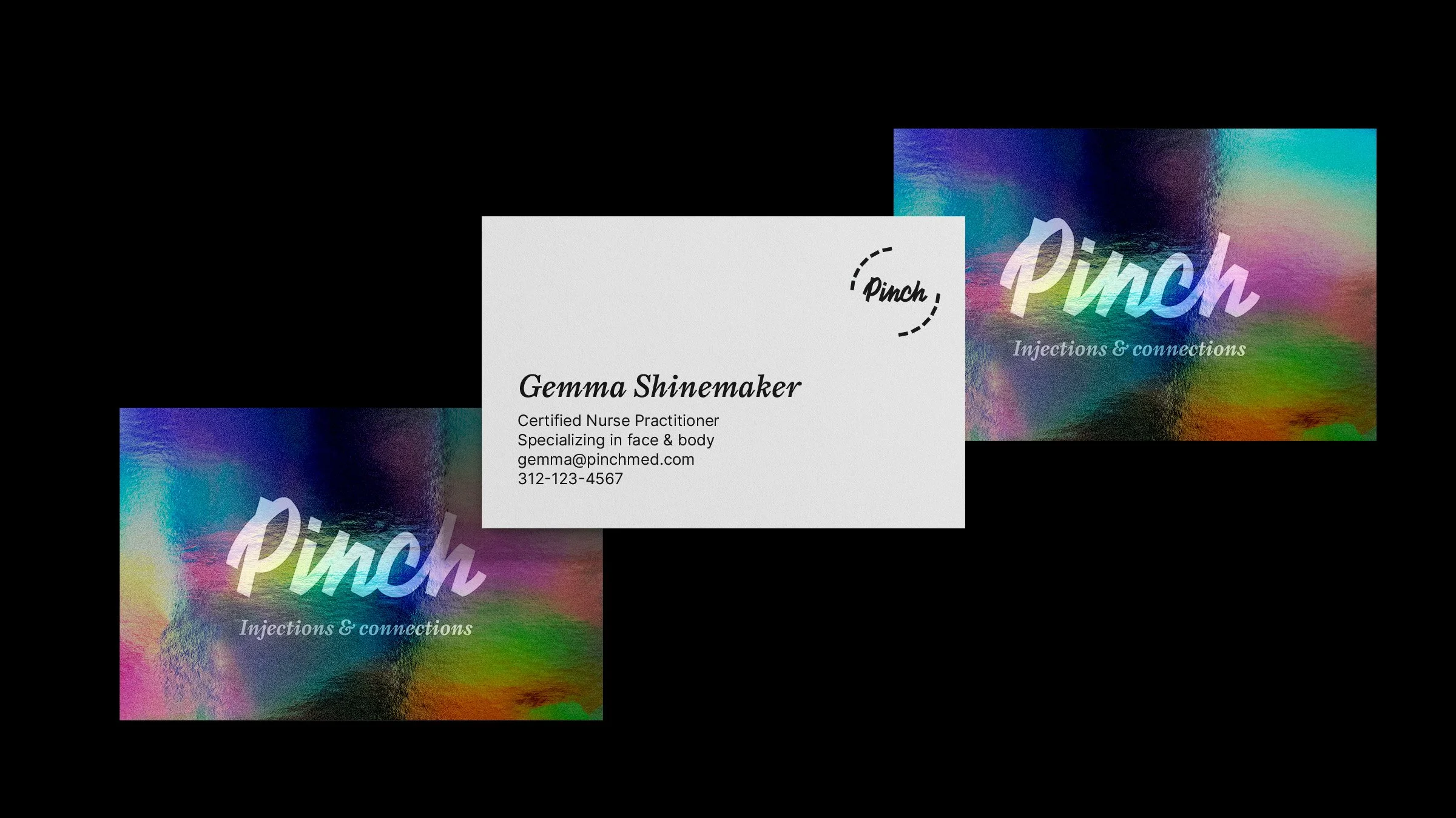
The identity looks like it sounds: pinch. A quick, precise mark with a playful edge. Bright, modern, and a little electric, built to feel friendly without getting soft.
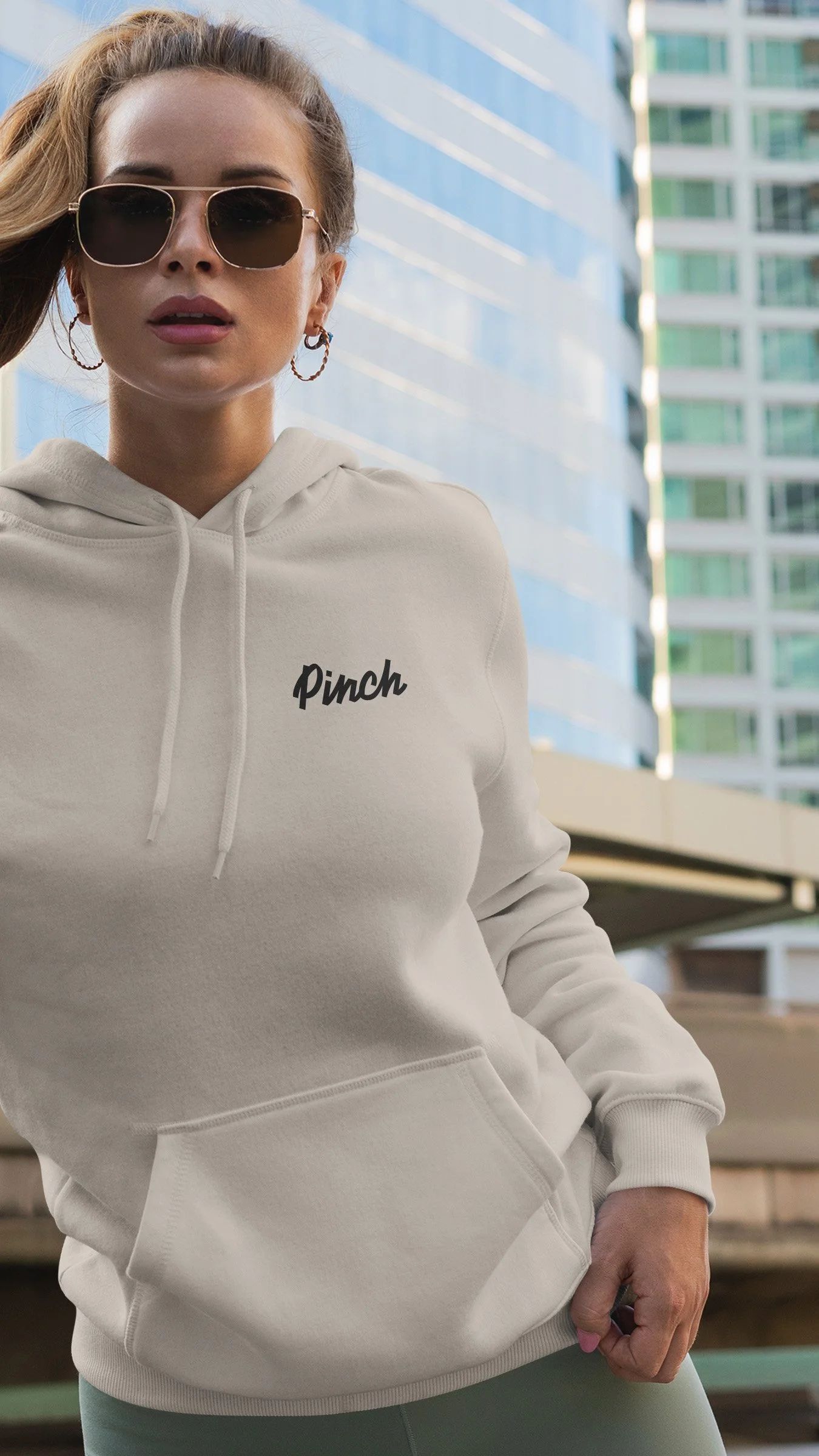
We created the visual identity and rolled it out across the brand world, from social and email to print pieces, landing page layouts, and swag. A system that stays clean, recognizable, and ready to travel wherever Pinch shows up.
Client:
Pinch
Chicago
Our Role:
Logo & Visual Identity
OOH
Digital Assets
Company Swag
Copy & Messaging