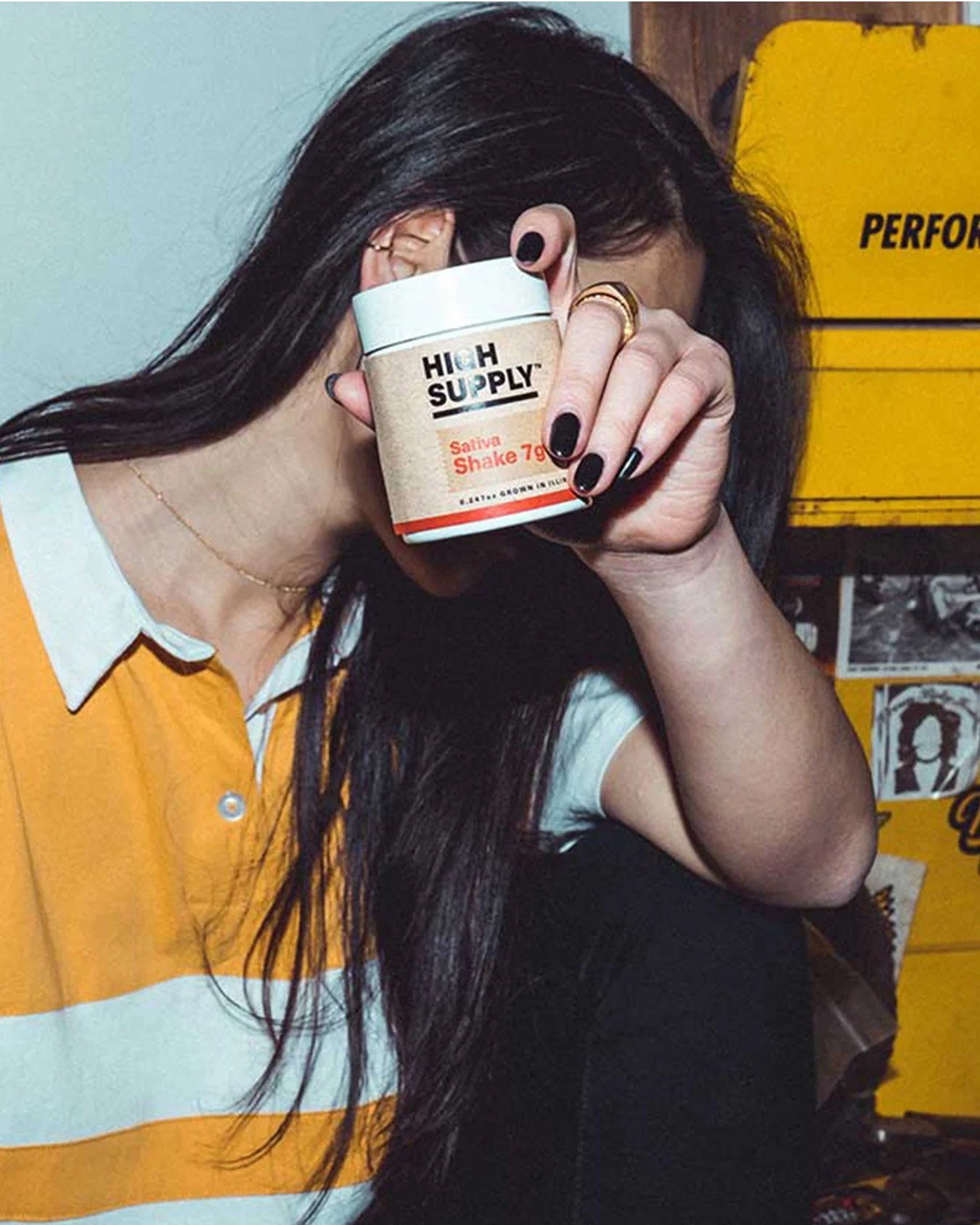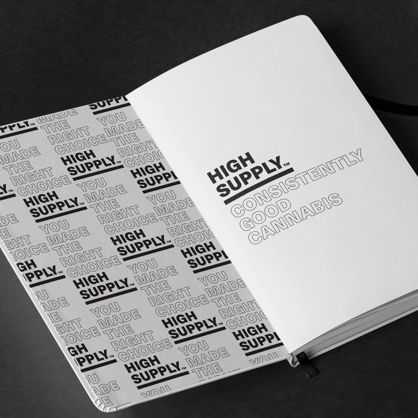
Consistently good cannabis
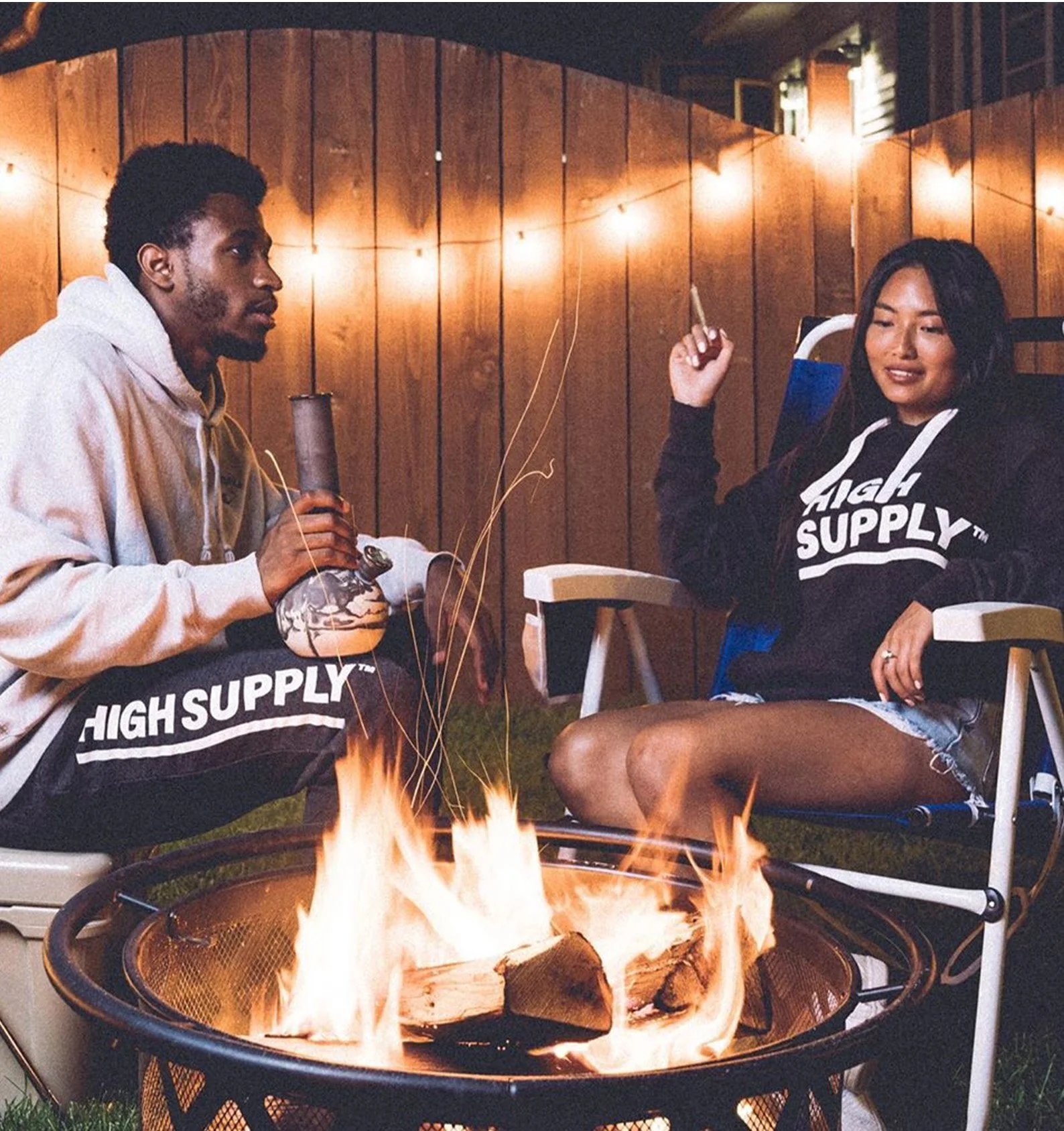
High Supply is Cresco’s value brand built around one promise: you never have to worry about running low. The strategy leans into what the customer already cares about most: reliable quality, bigger quantities, and an affordable price point. The voice stays direct and friendly, with no fluff, just the facts and a little attitude.
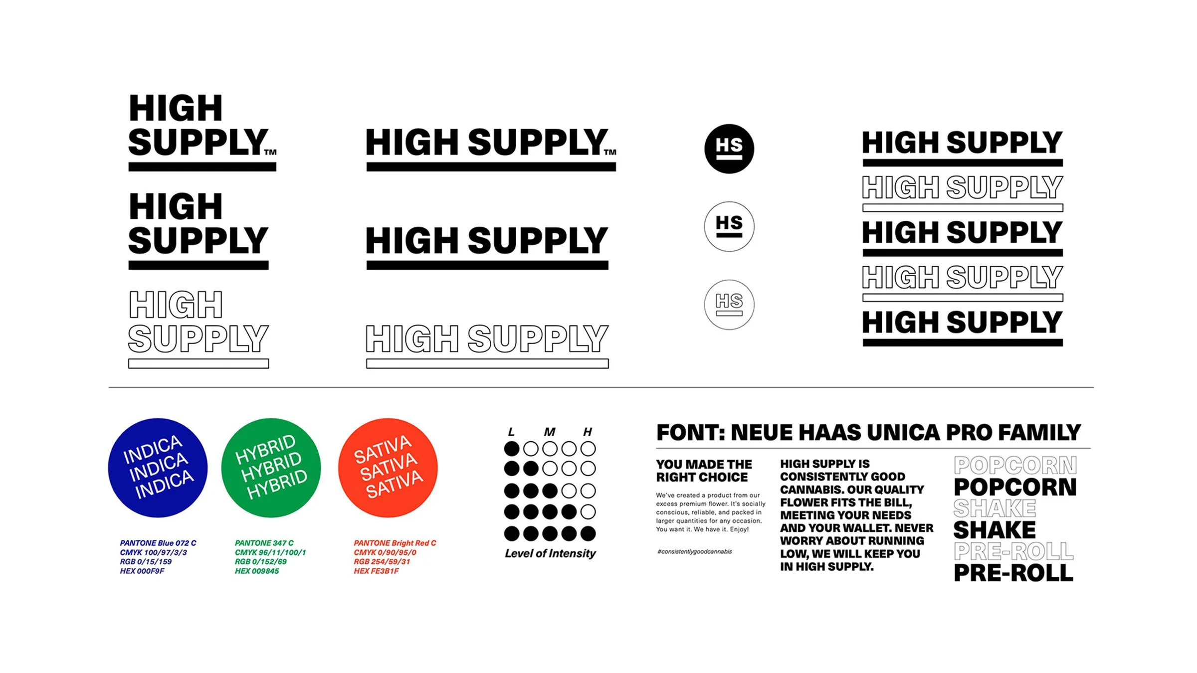
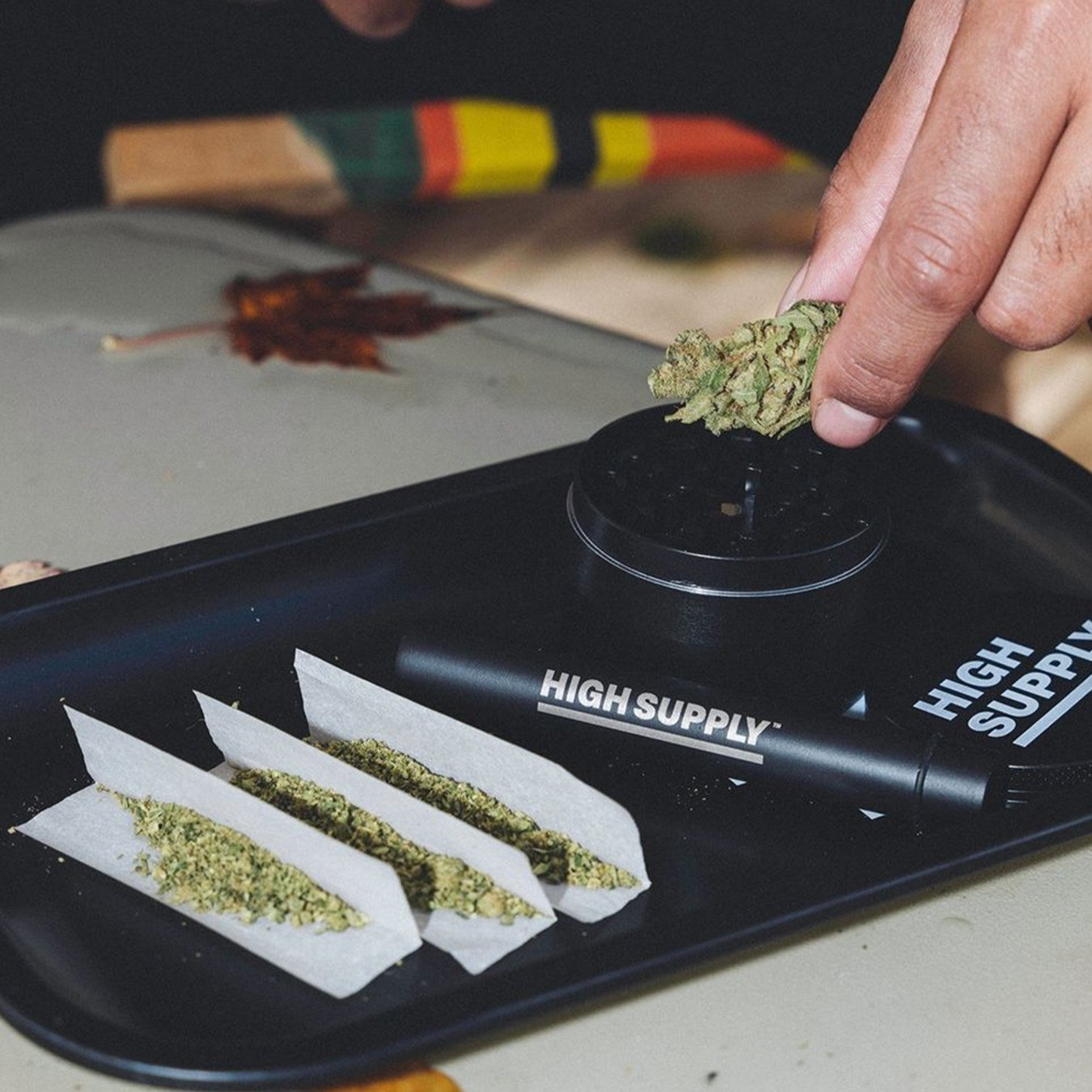
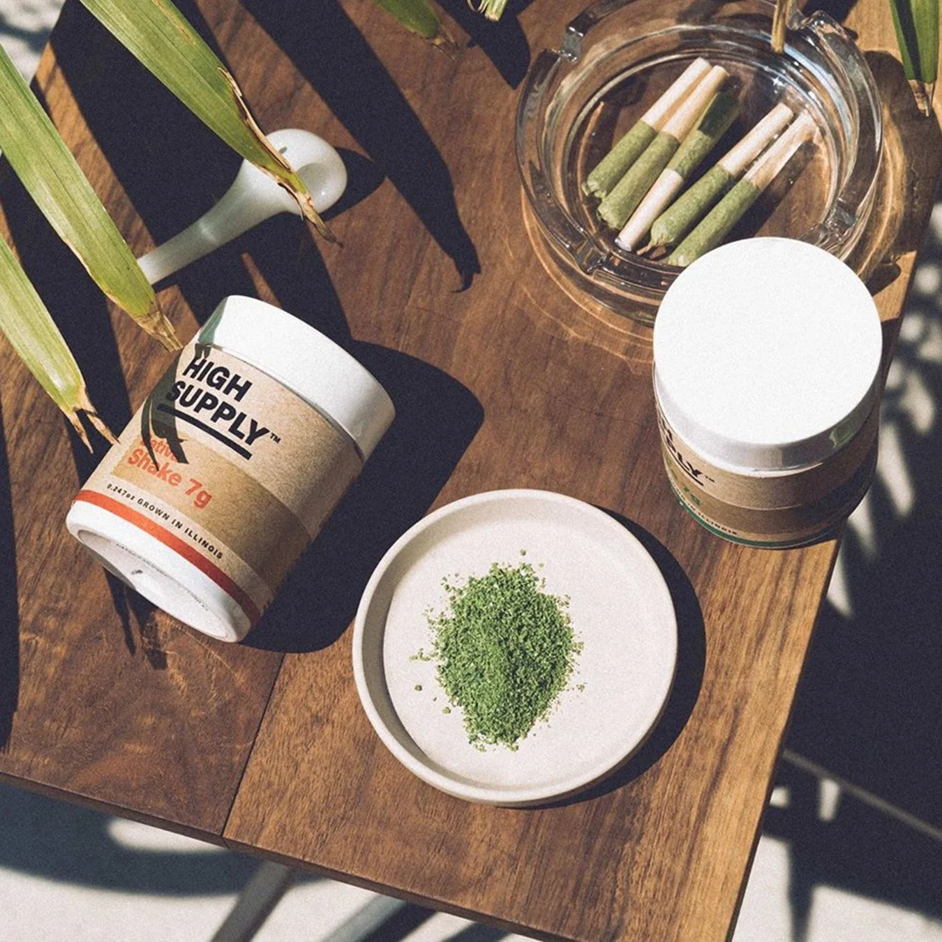
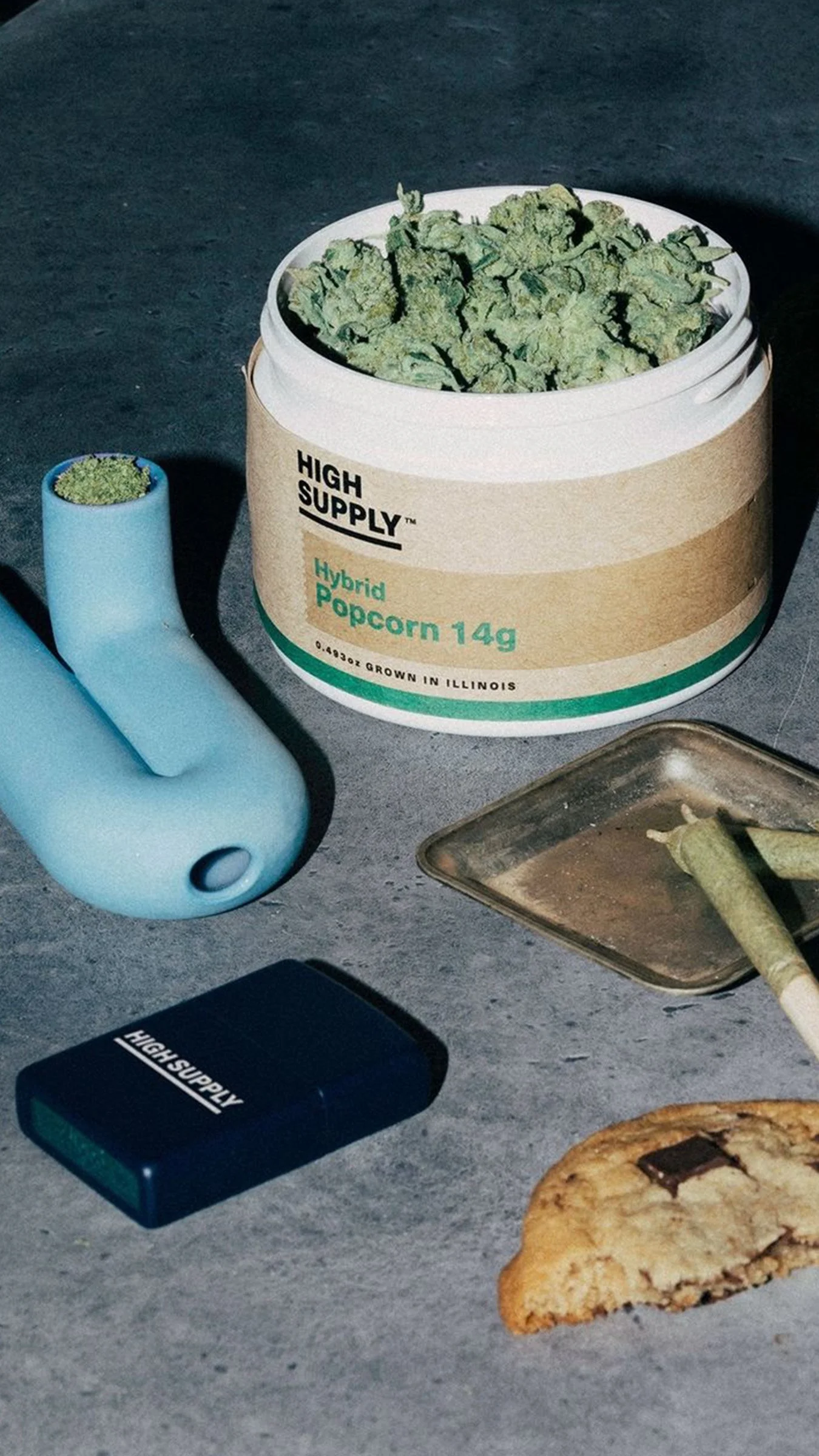
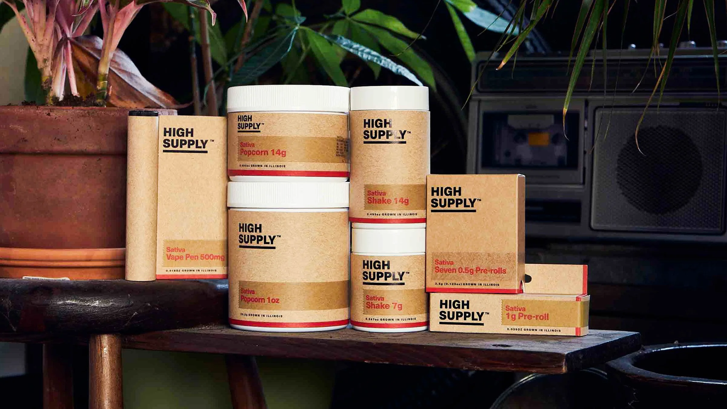
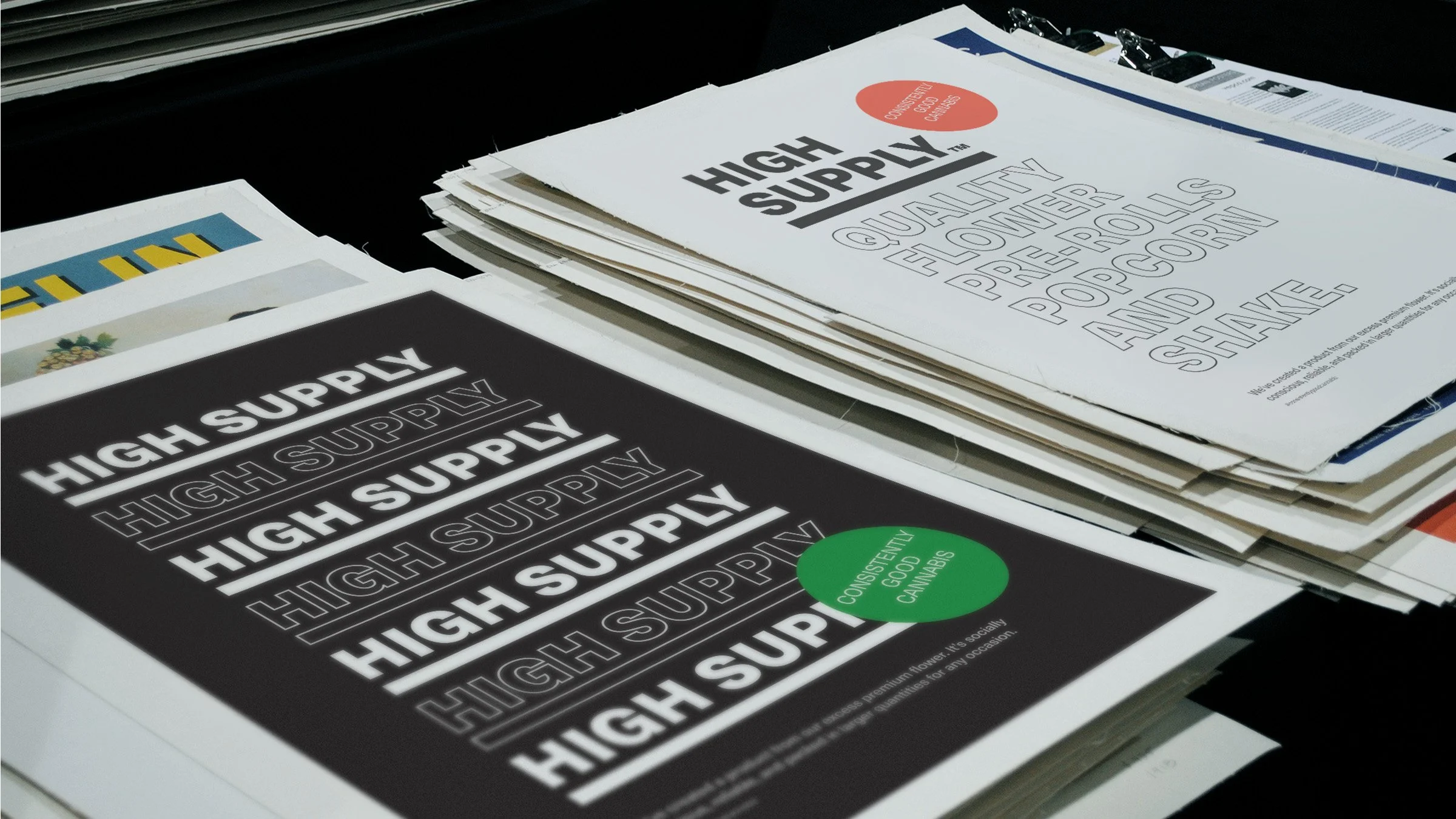
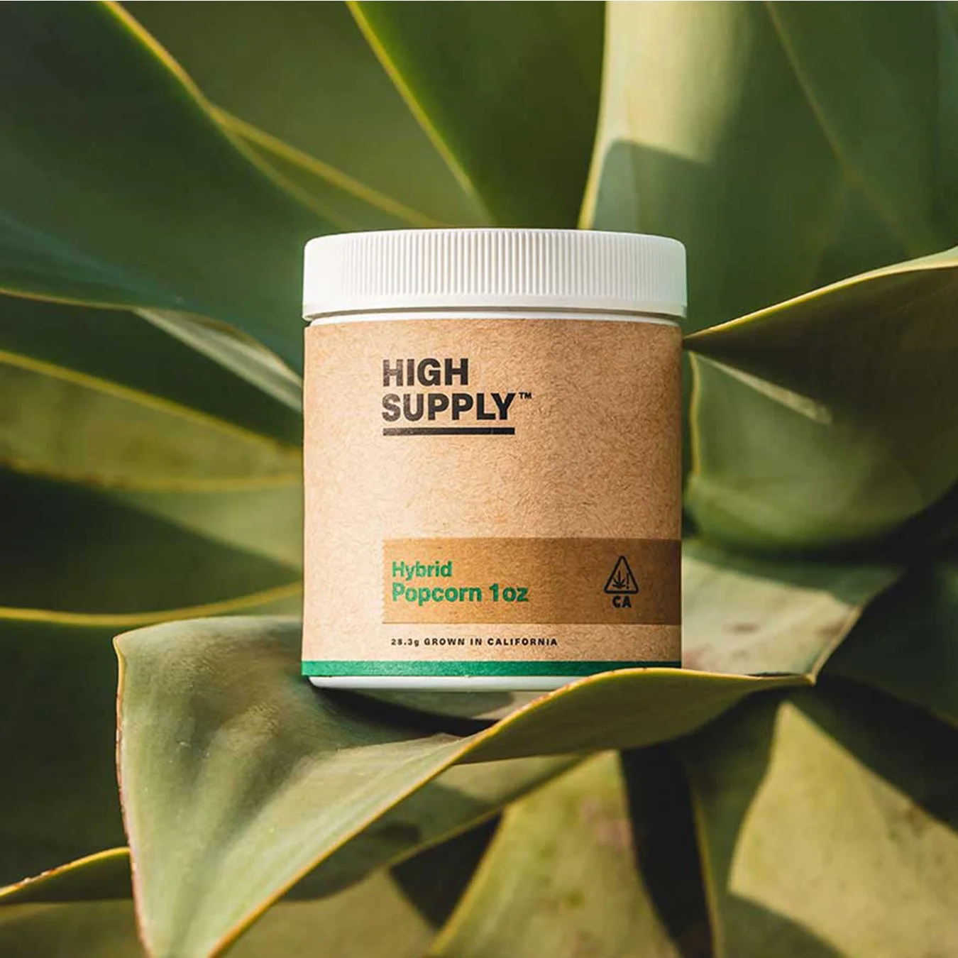
The identity is intentionally white-label simple, anchored by a bold High Supply wordmark set in Neue Haas Unica to communicate consistency and trust. The system stays mostly black and white, using flat primary color hits only to distinguish Indica, Hybrid, and Sativa for fast decision-making. A repeating outline and solid logo pattern nods to the classic carryout thank-you bag, giving the brand a familiar, everyday feel across packaging and swag. Photography supports the same POV: urban, in-the-moment, human.
Client:
High Supply by Cresco Labs
Chicago, IL
Our Role:
Brand Strategy
Brand Concept
Logo & Visual Identity
Labels & Packaging
Brand Messaging
Digital Assets
Campaign
“It’s rare to find a team that can have so much passion and conviction for an idea, and yet be so willing to change directions or re-think an approach on a dime. It requires a collective confidence in knowing that the creative well is deep and that there’s always another way to crack the code.”