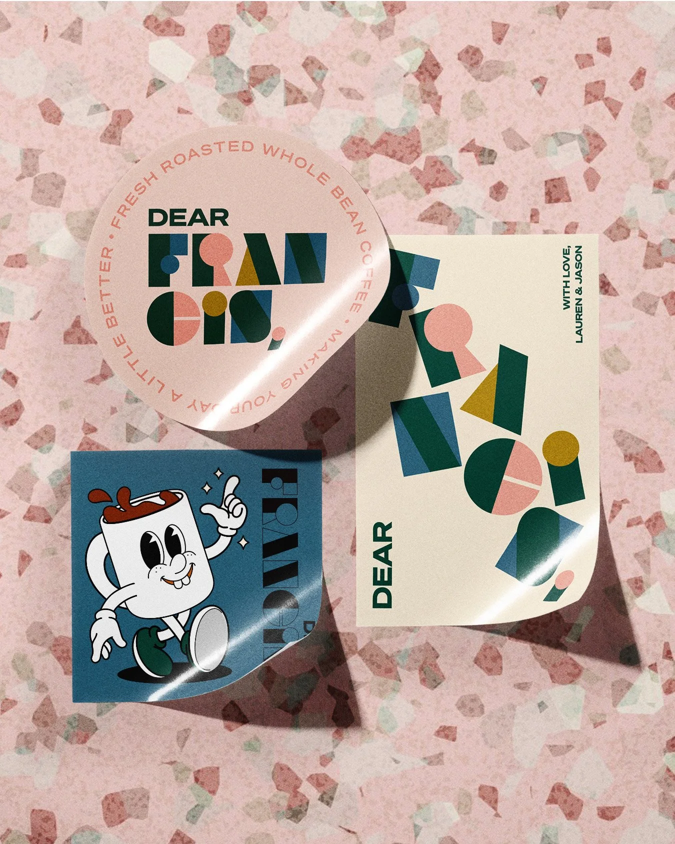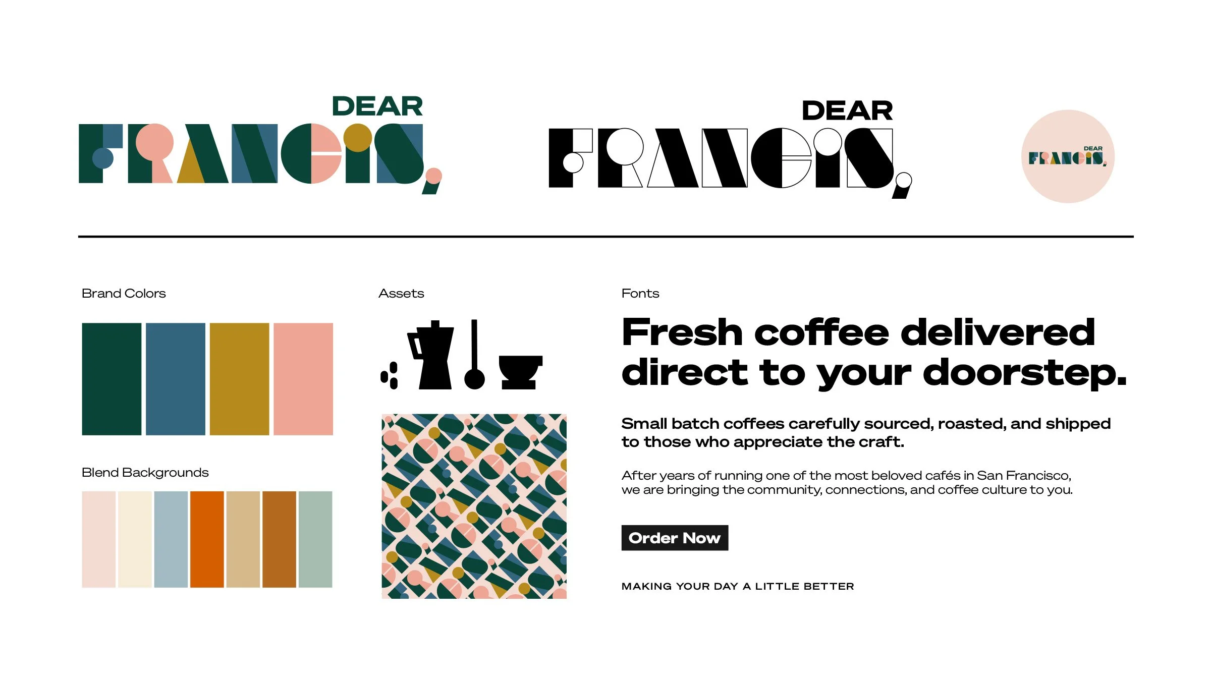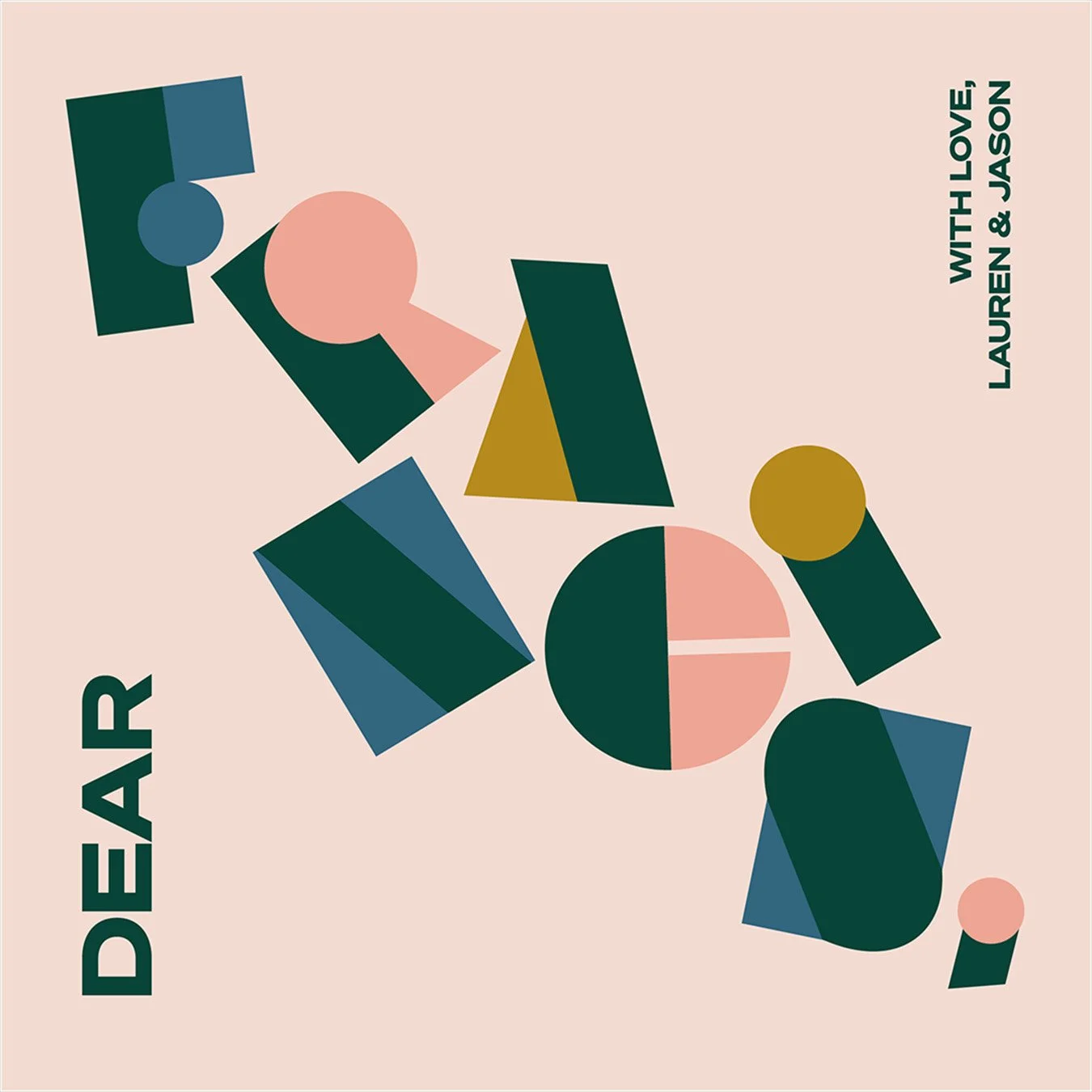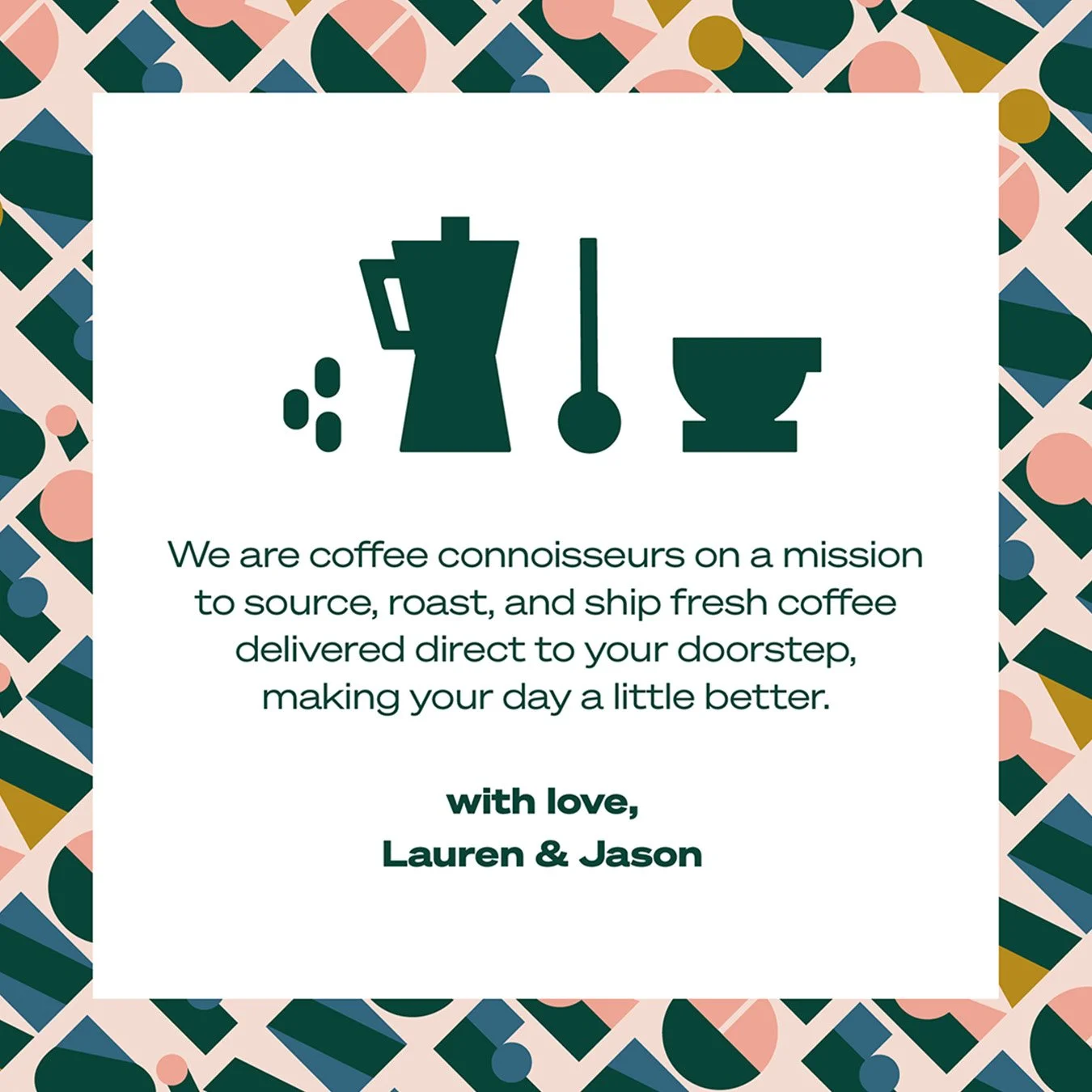
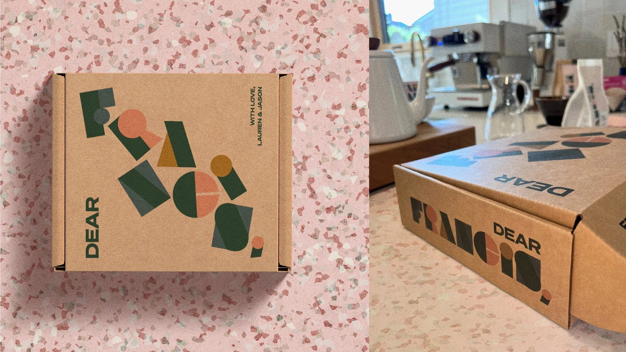
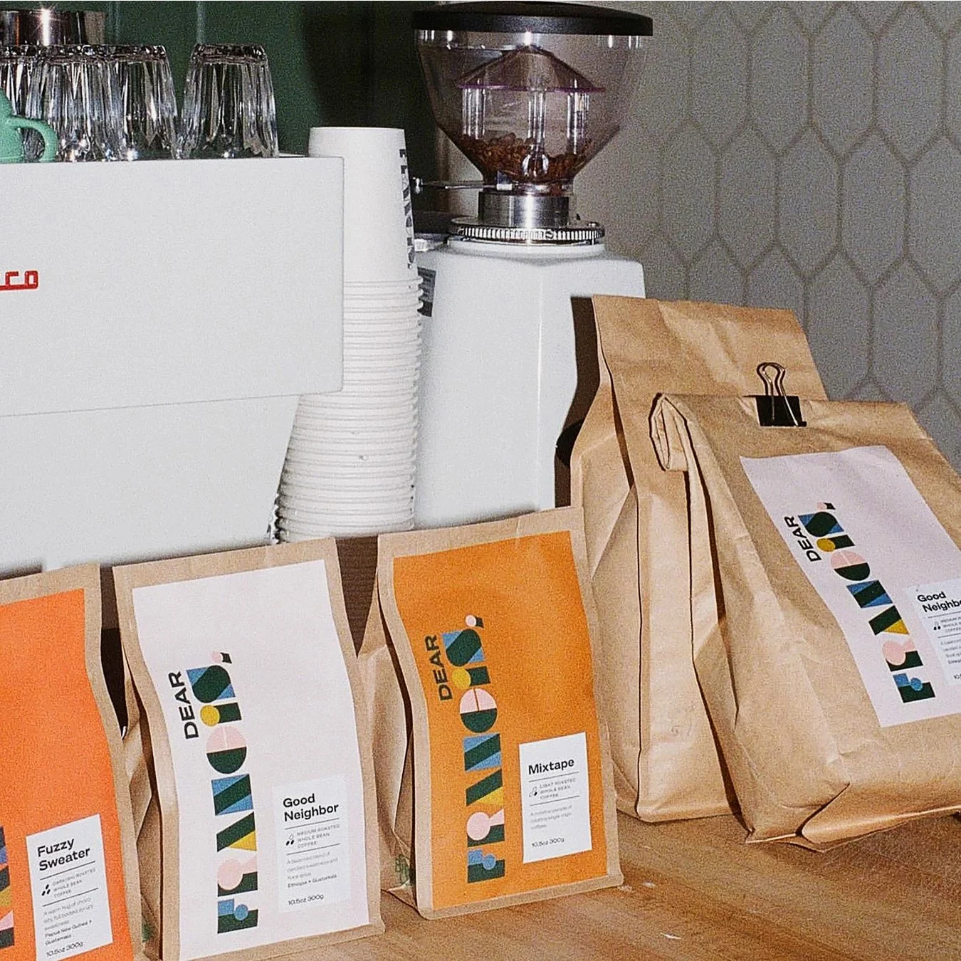
A love letter to coffee
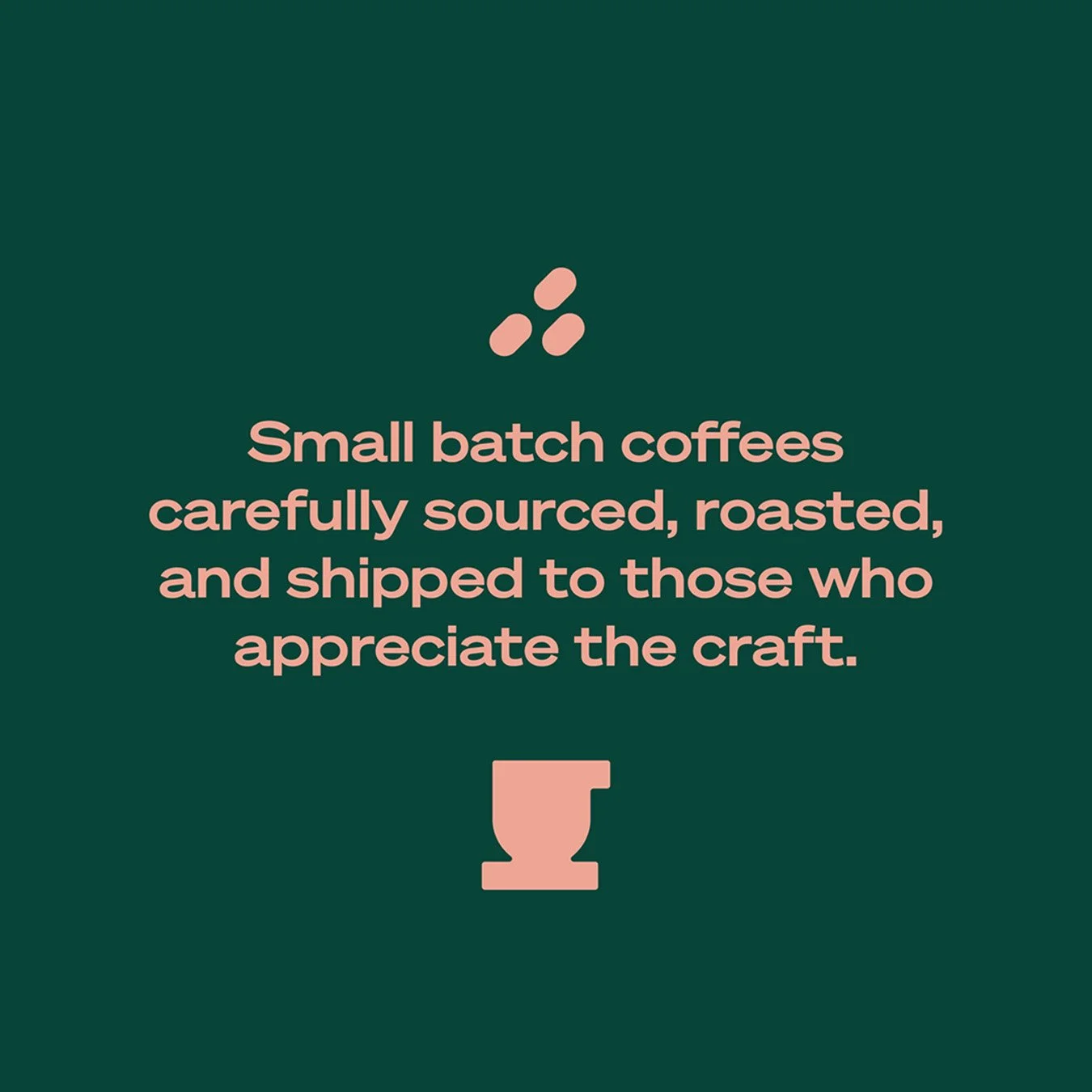
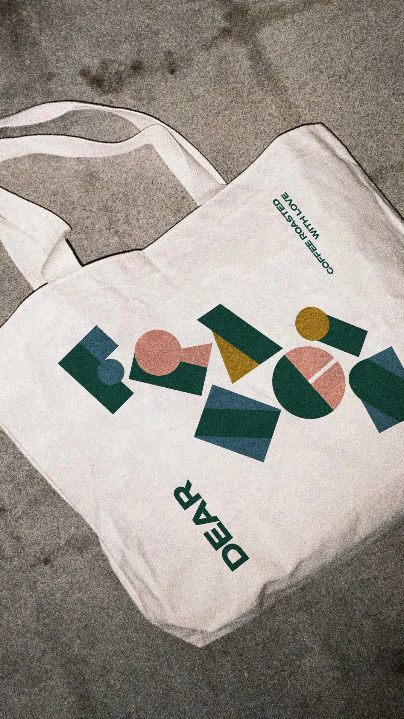
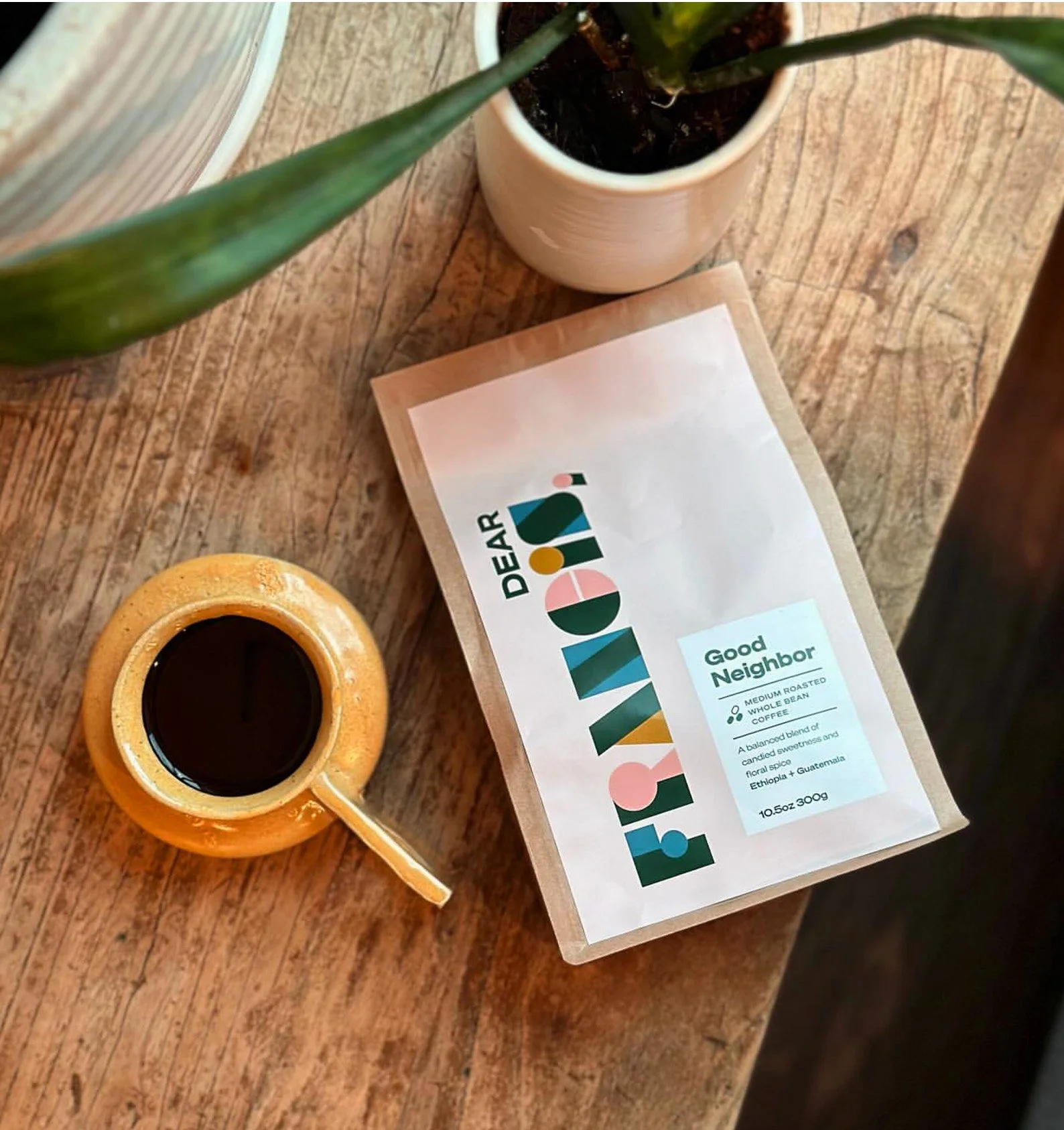
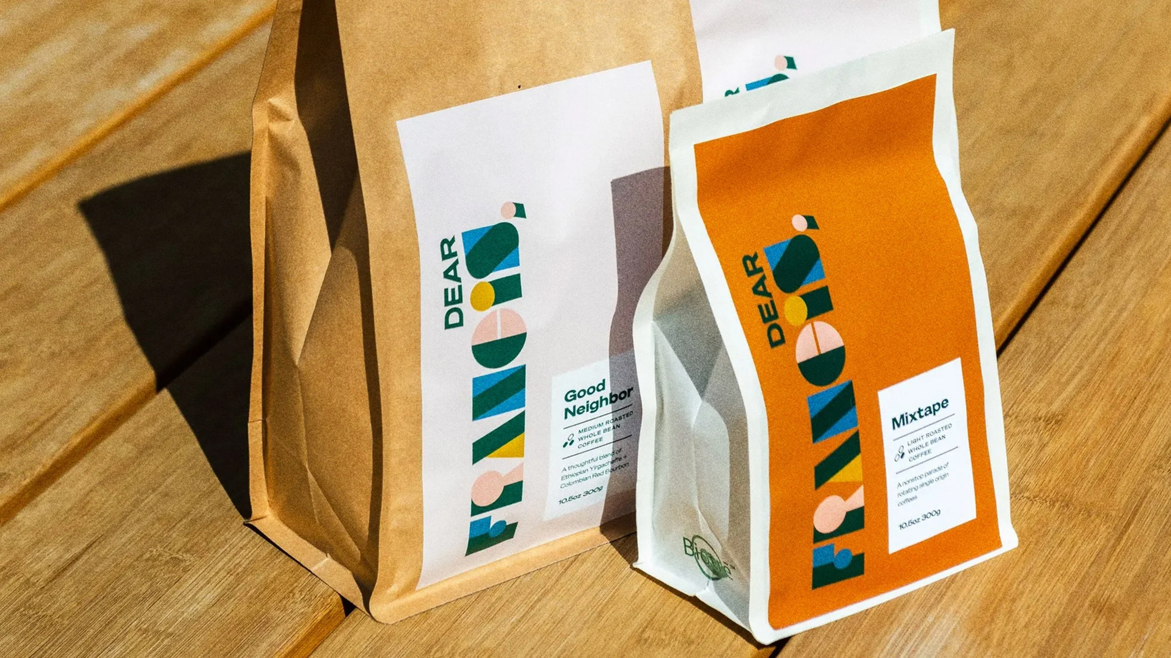
Dear Francis was born from a love of the café experience, daily conversations, and the connections made over a cup of coffee. To capture the nostalgic era of community and culture, we drew inspiration from vintage Vanity Fair magazine lettering, creating a style that is unique and attention-grabbing while evoking a sense of joy and playfulness. Our rich, warm, and earthy palette gives every coffee bag its own signature color. The dynamic wordmark adds movement and energy, ensuring the packaging stands out on the shelf and resonates with coffee lovers. Our goal was to craft a visual identity that not only reflects the quality of the coffee but also enhances the overall experience, making each cup of Dear Francis truly special.
Client:
Dear Francis
Portland, Oregon
Our Role:
Brand Strategy
Logo & Visual Identity
Labels & Packaging
Illustration
Digital Assets
“We absolutely LOVE Dear Francis! Thank you for going the extra mile with our project and leaving us with such versatile assets.”